About.
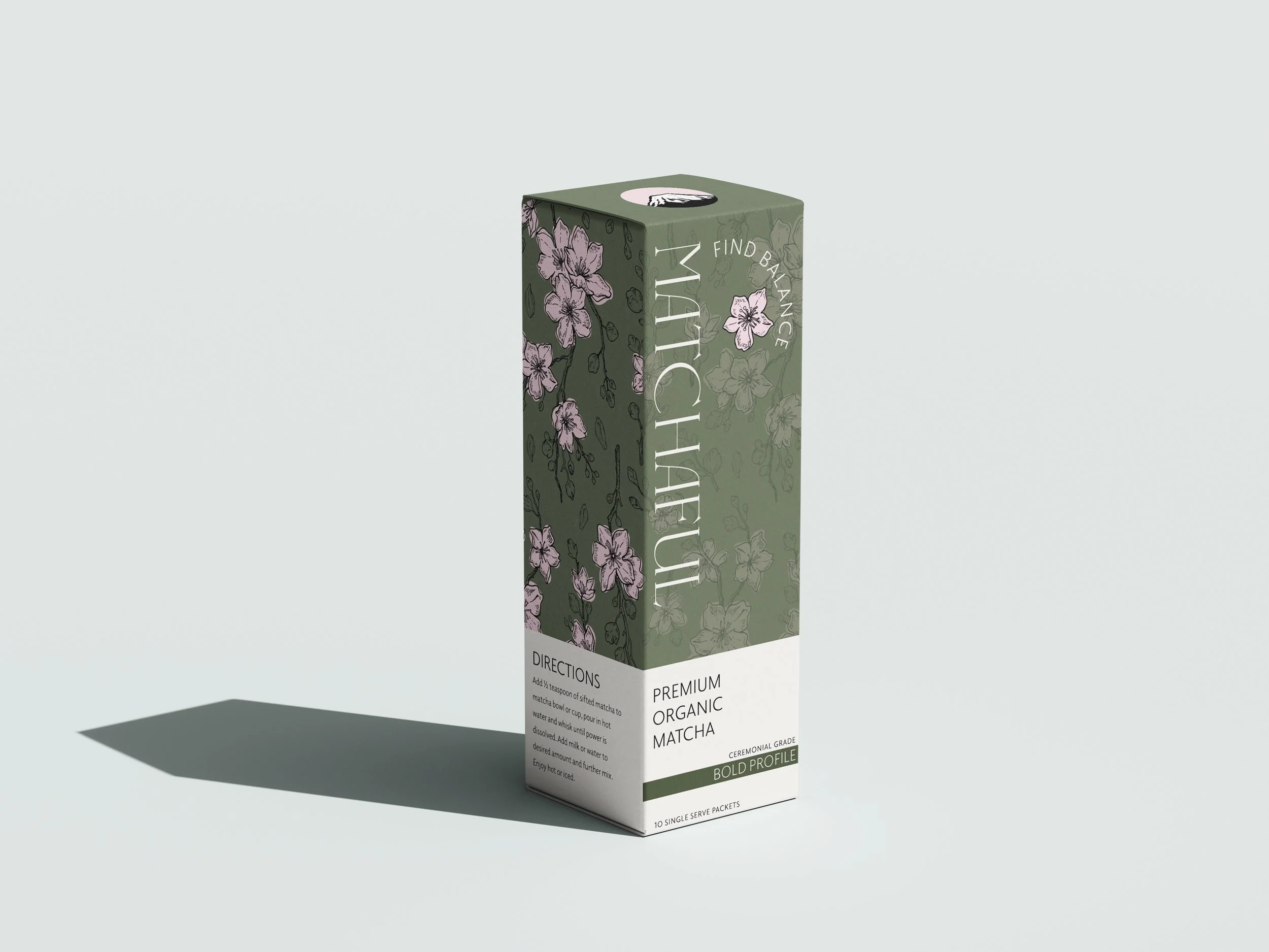
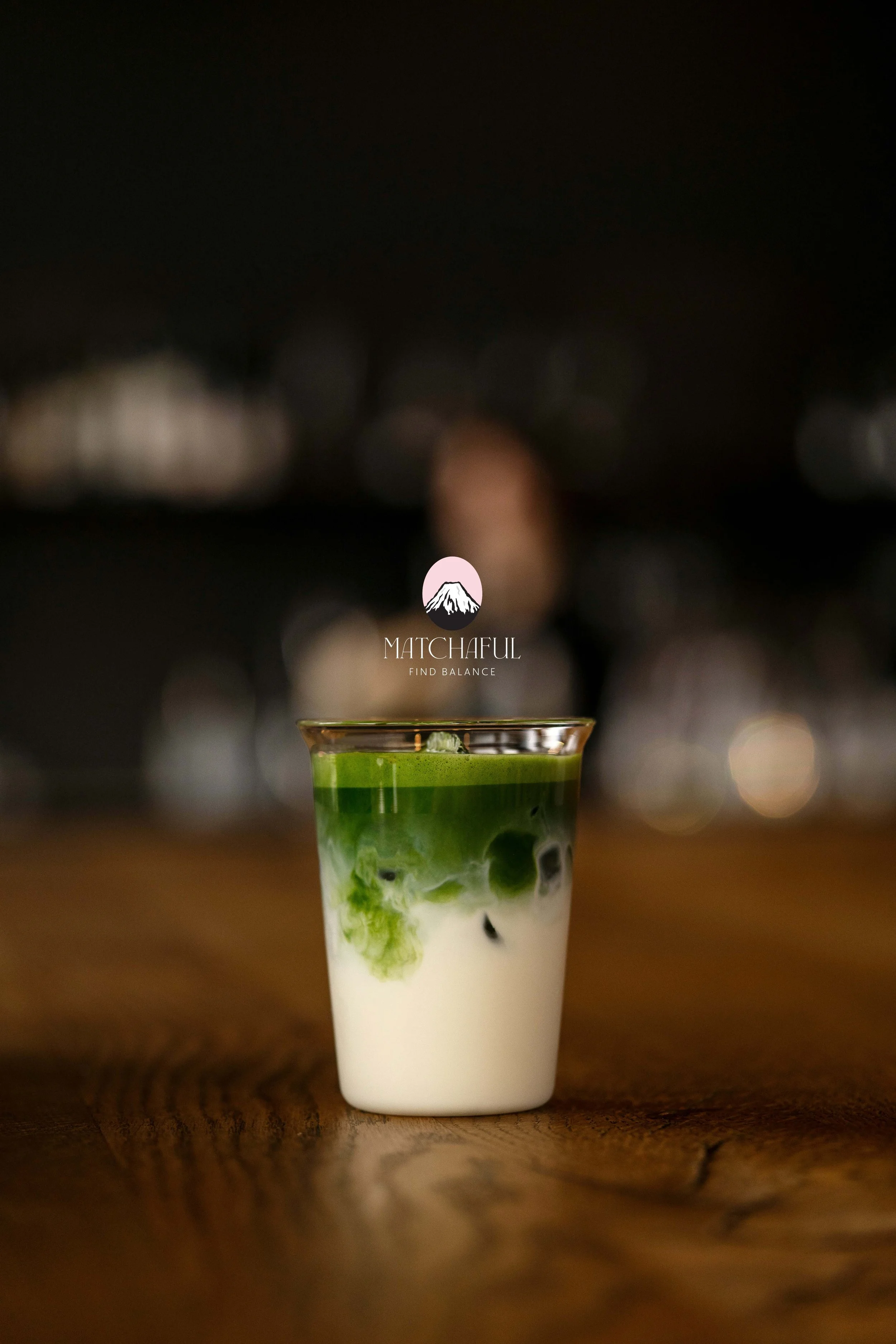
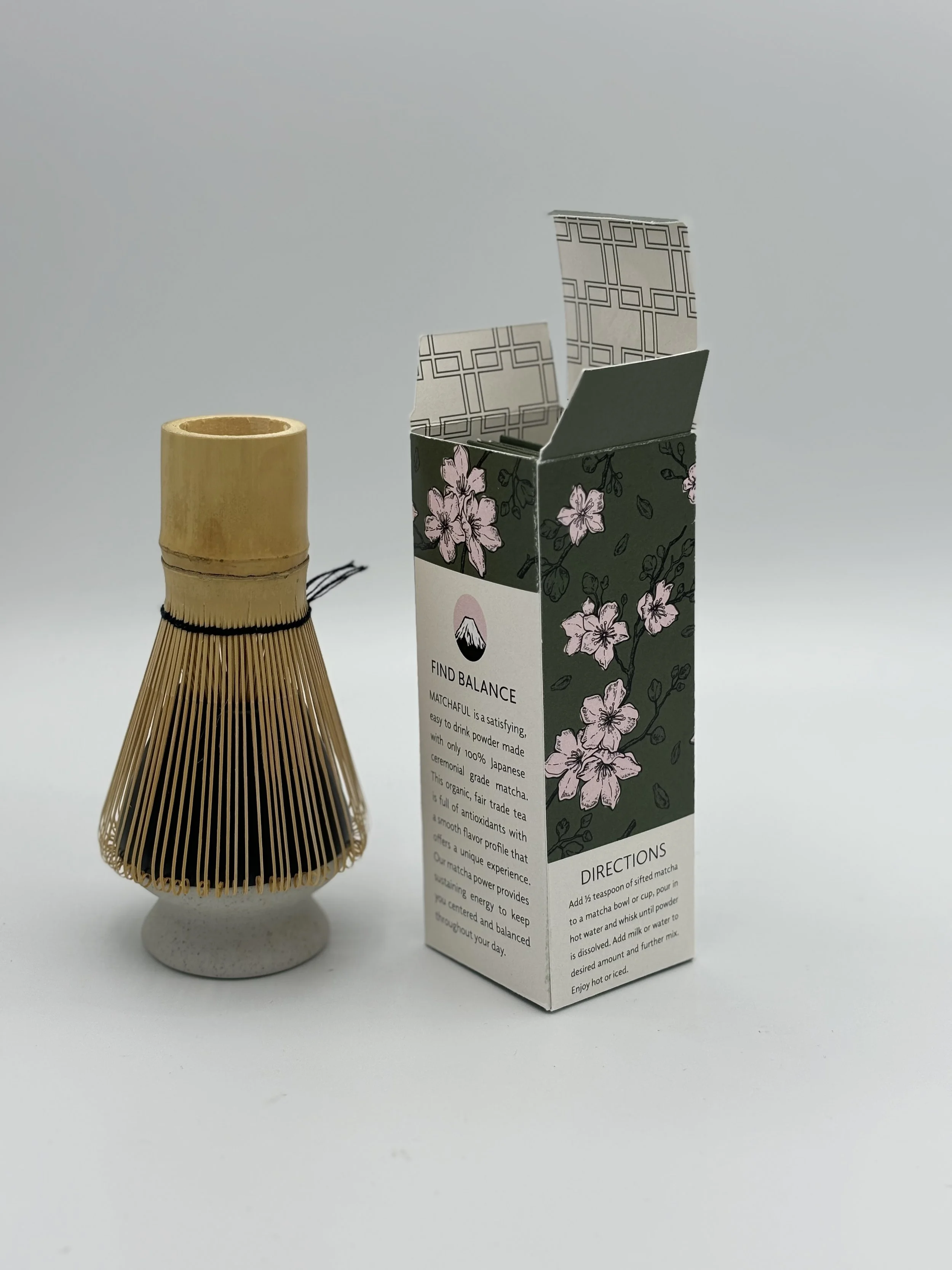
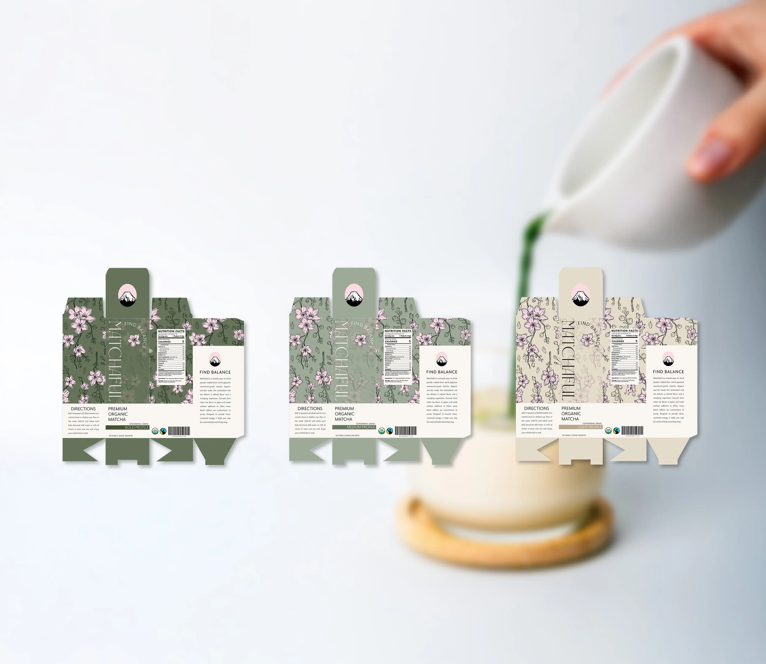
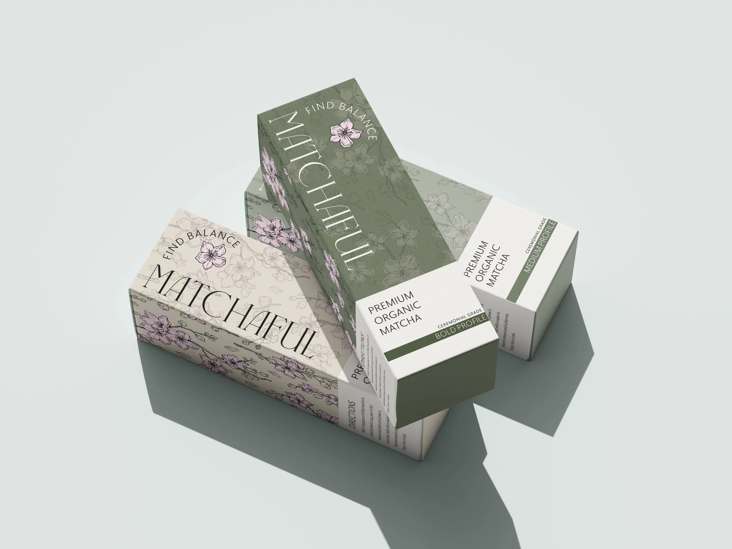
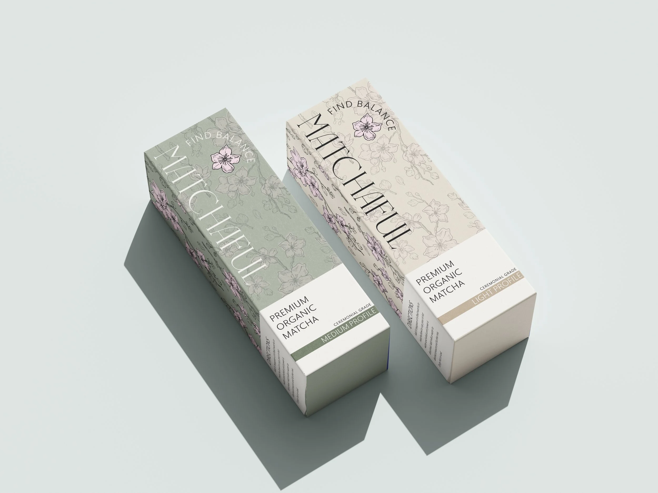
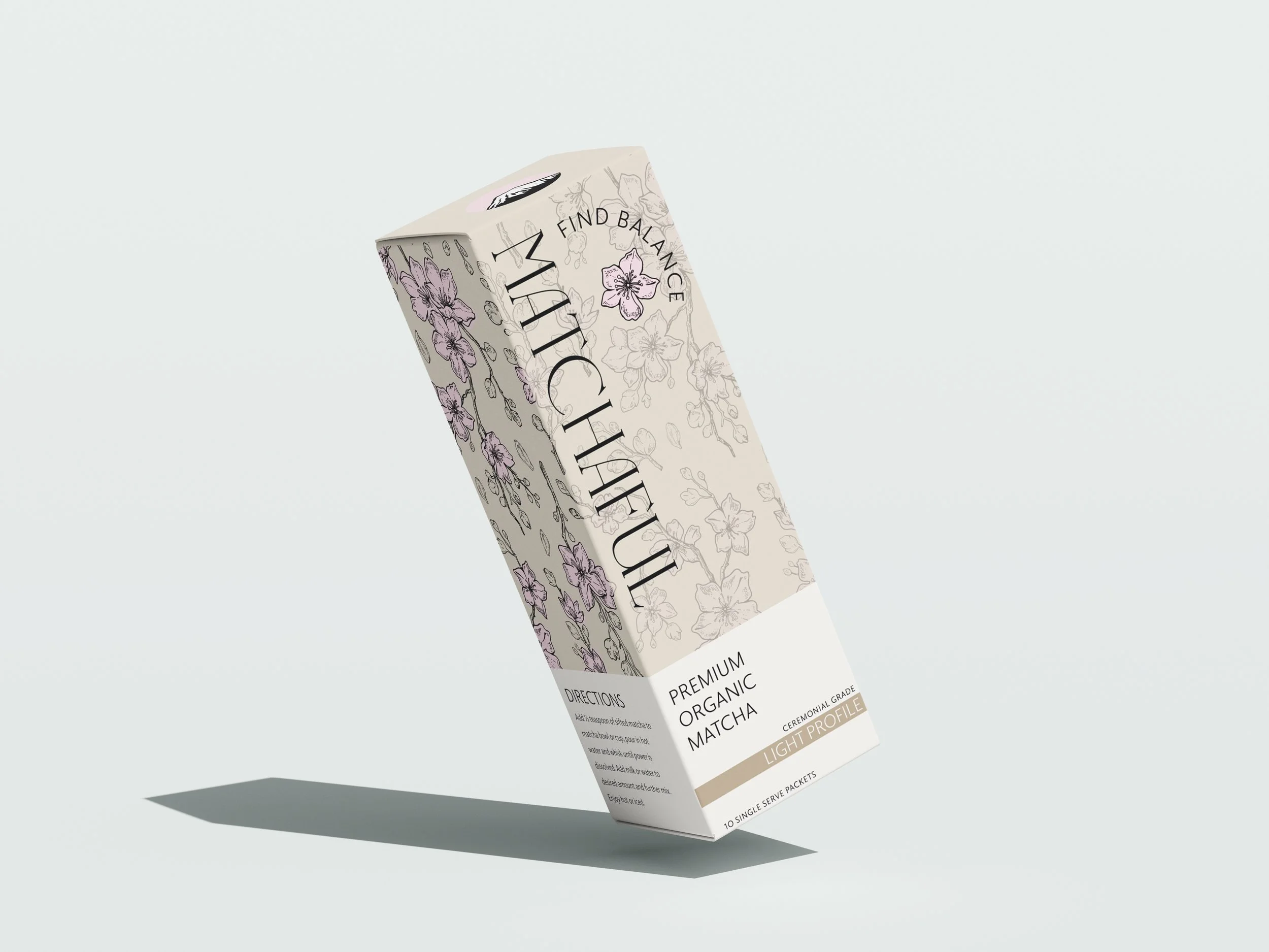
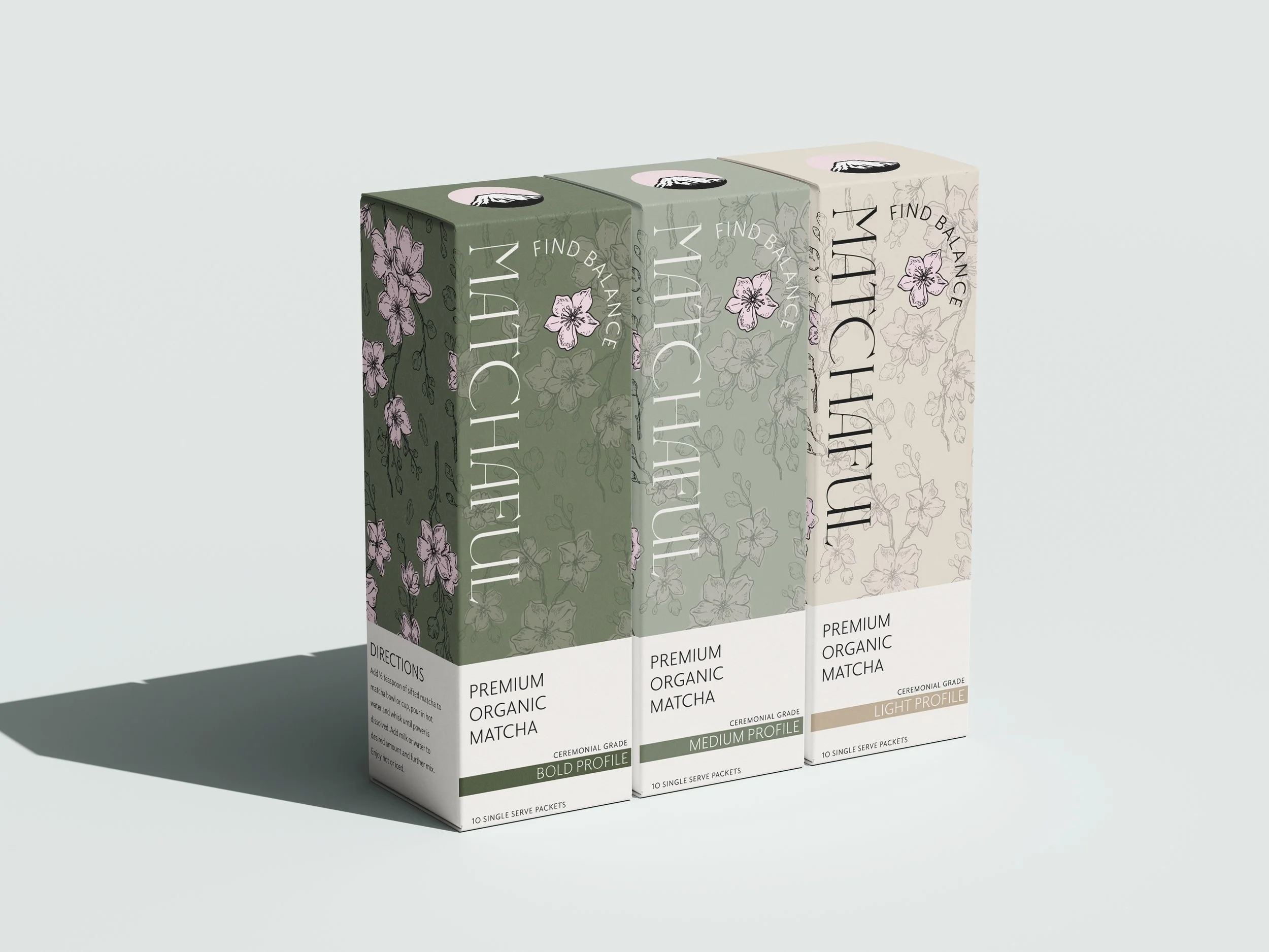
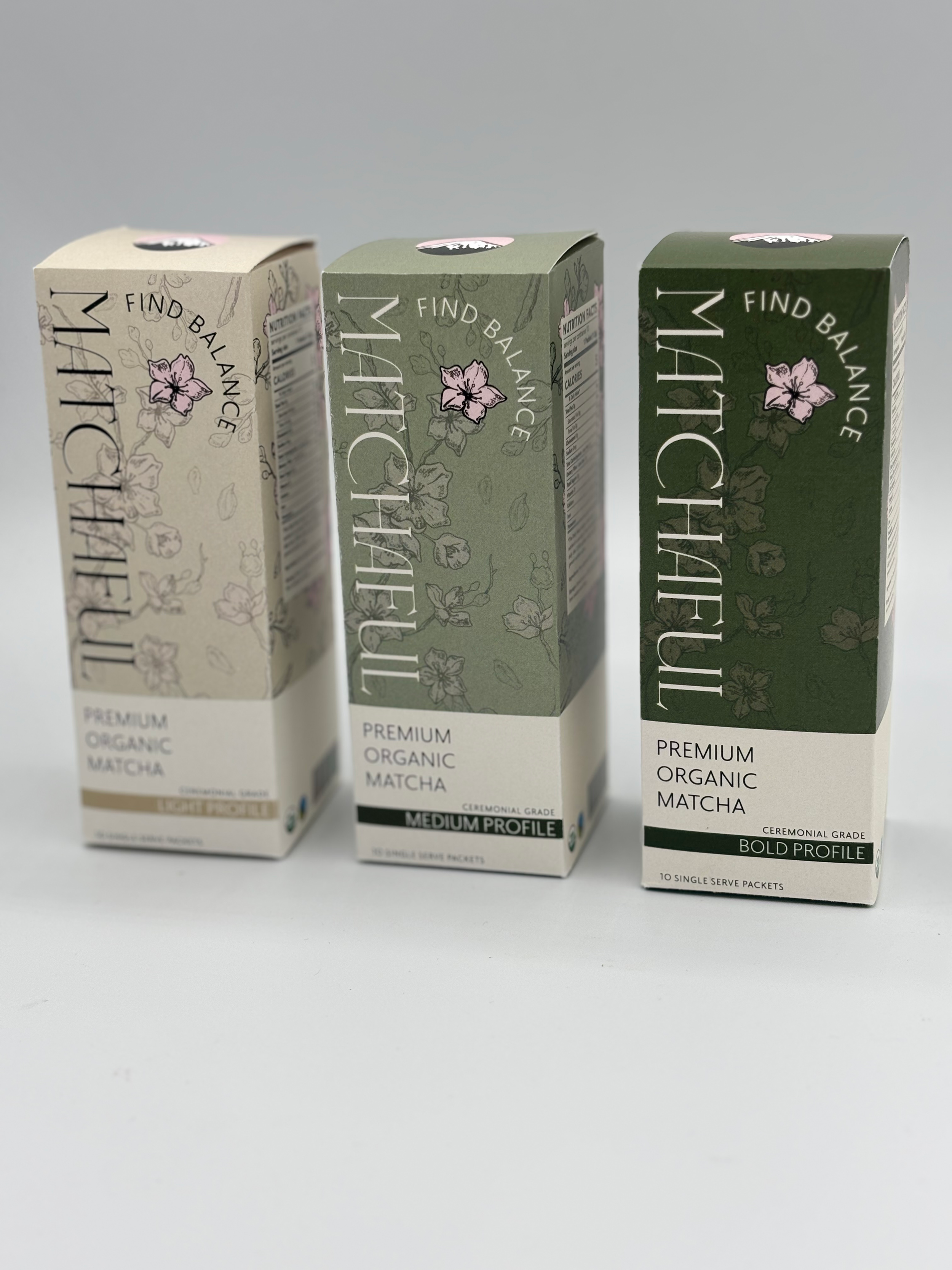
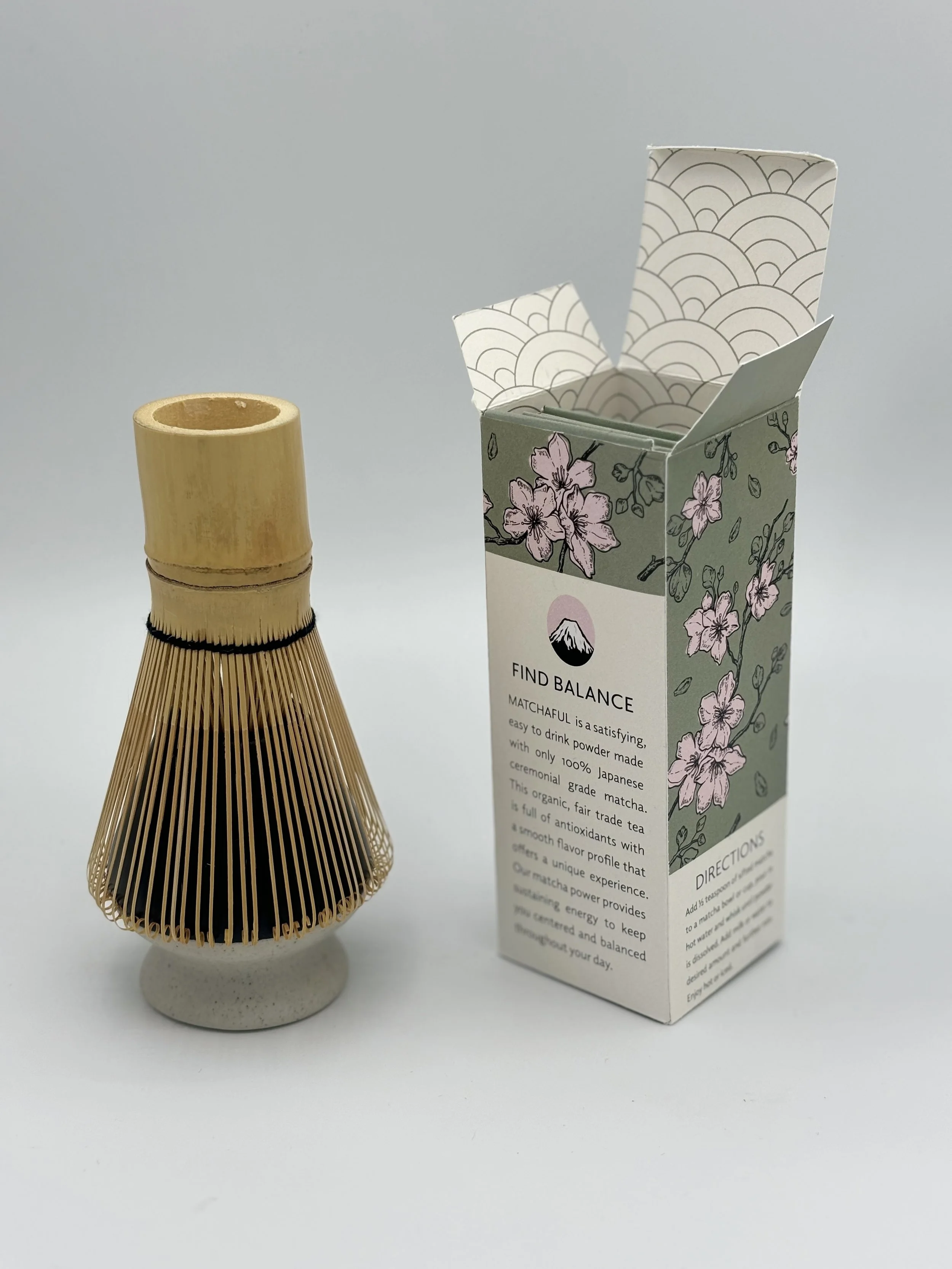
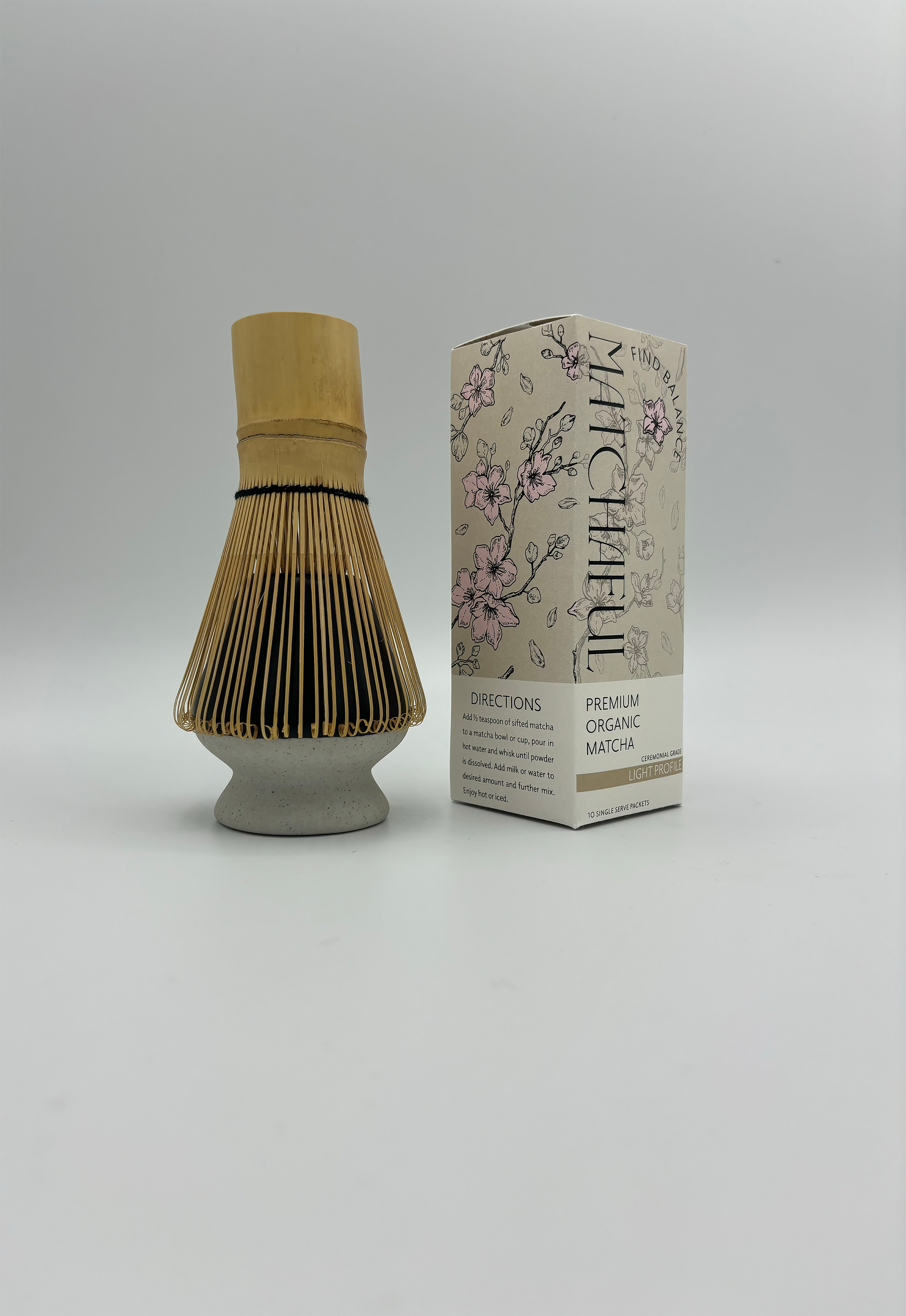
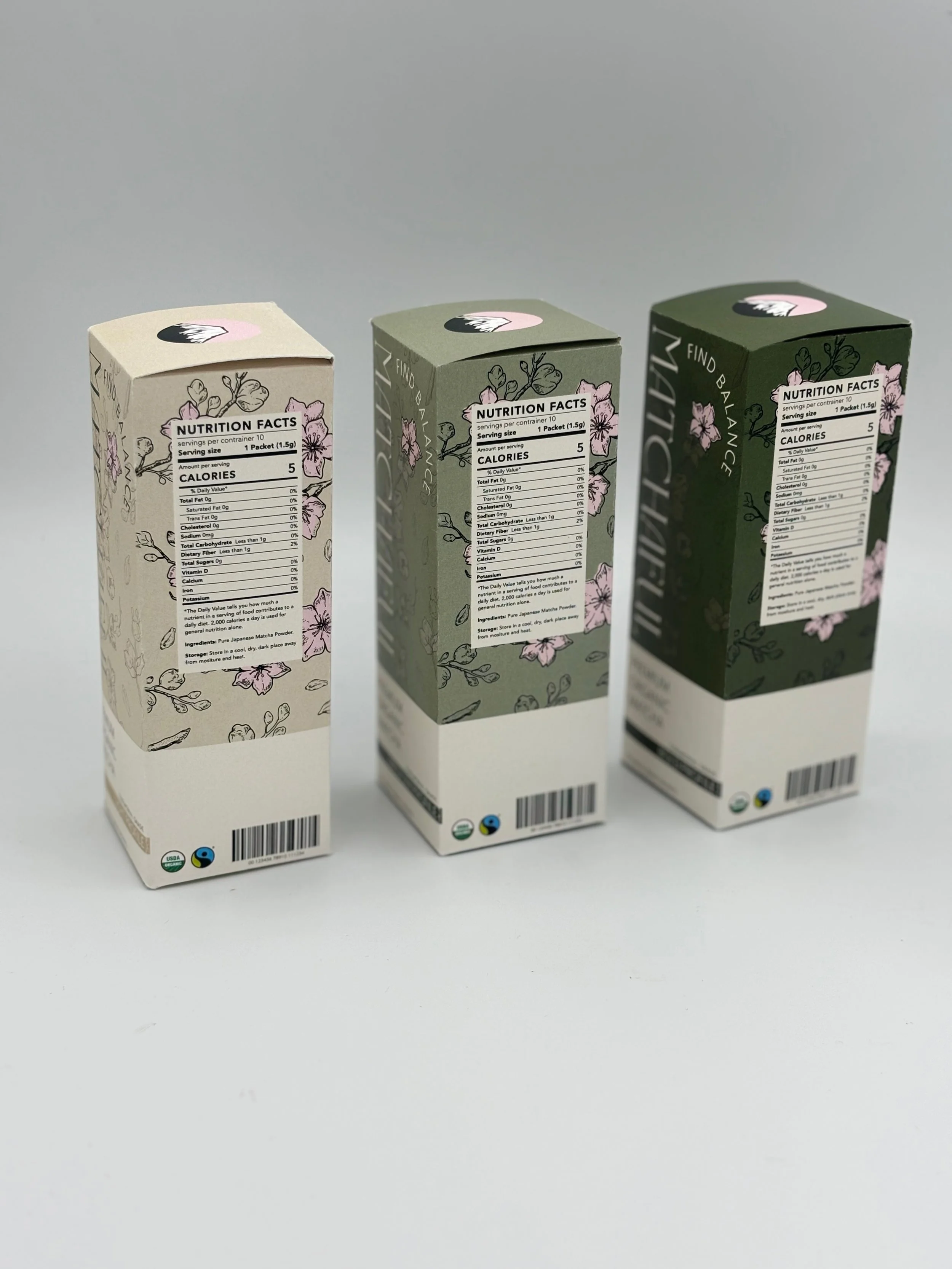
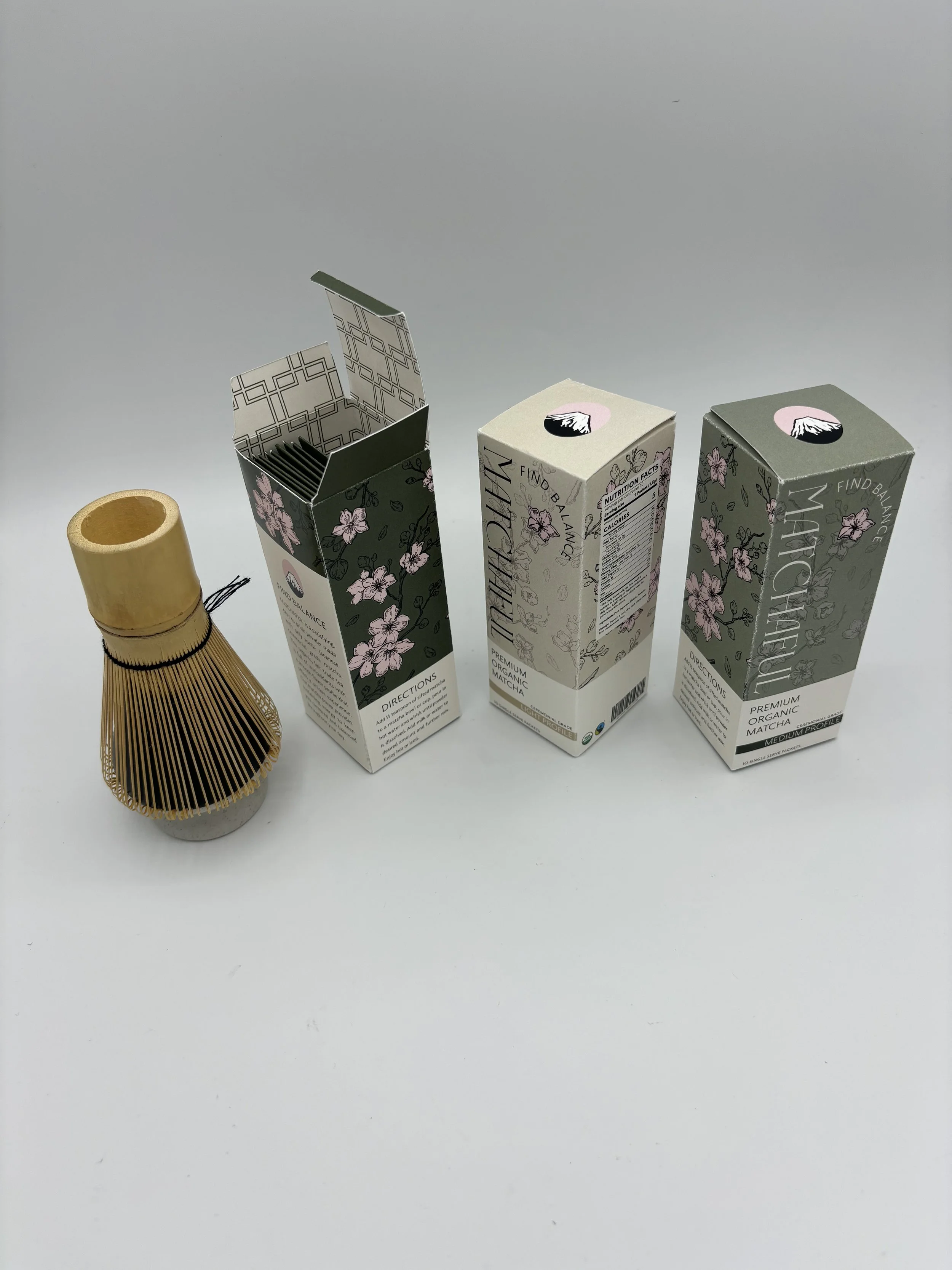
Matchaful is an organic, fair-trade matcha company that reflects luxury and purity. The branding uses inspiration from Japan, the origin of matcha, to create a trustworthy, eye-catching image. Images of Cherry Blossoms and Mount Fuji can be found on the packaging to create this image. This product features three different variations each with a different flavor profile. Matchaful invites consumers to slow down, reconnect, and find balance in every cup

The Logo.
Physical Comps.
The Challenge.
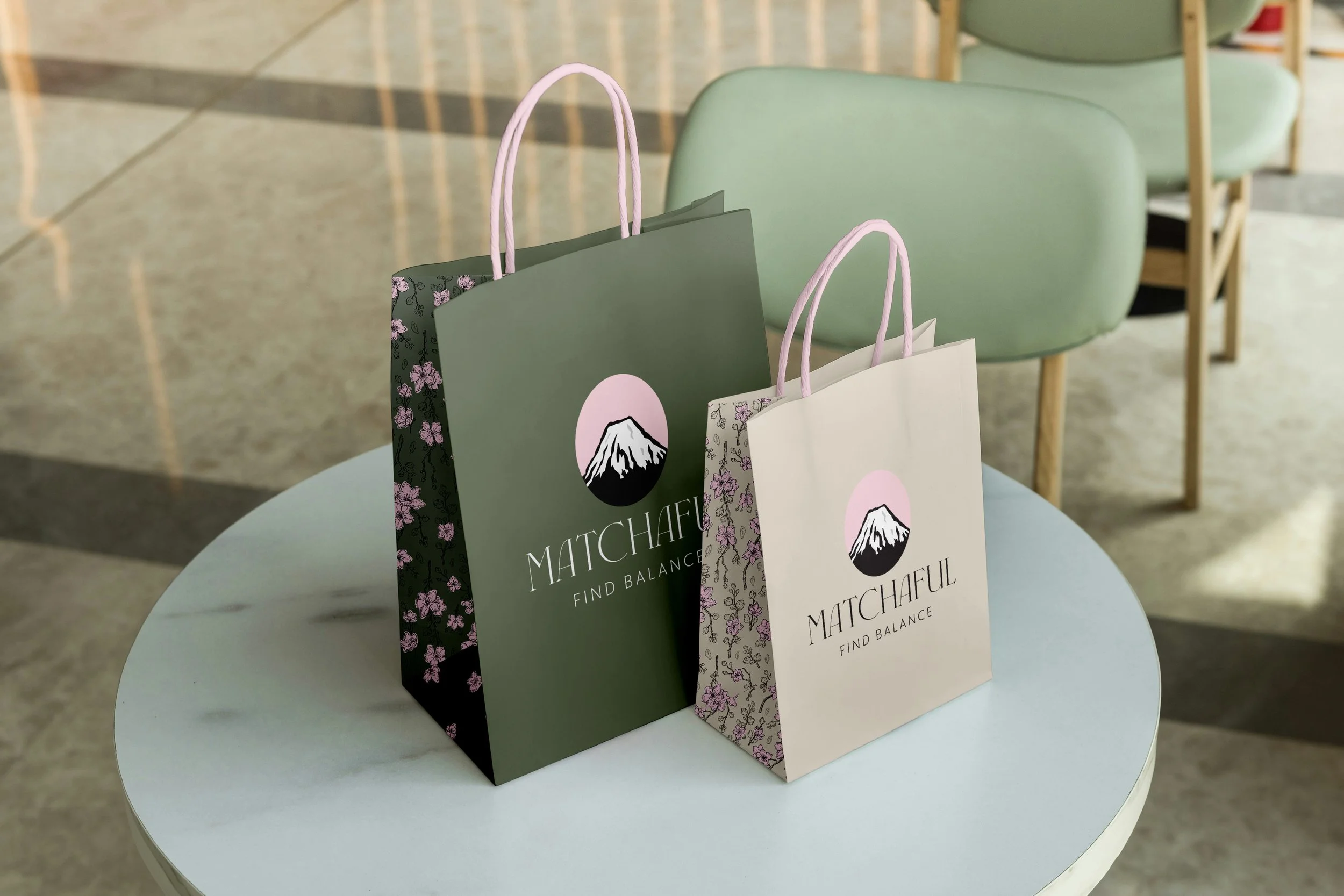
LOGO PROCESS
Results.
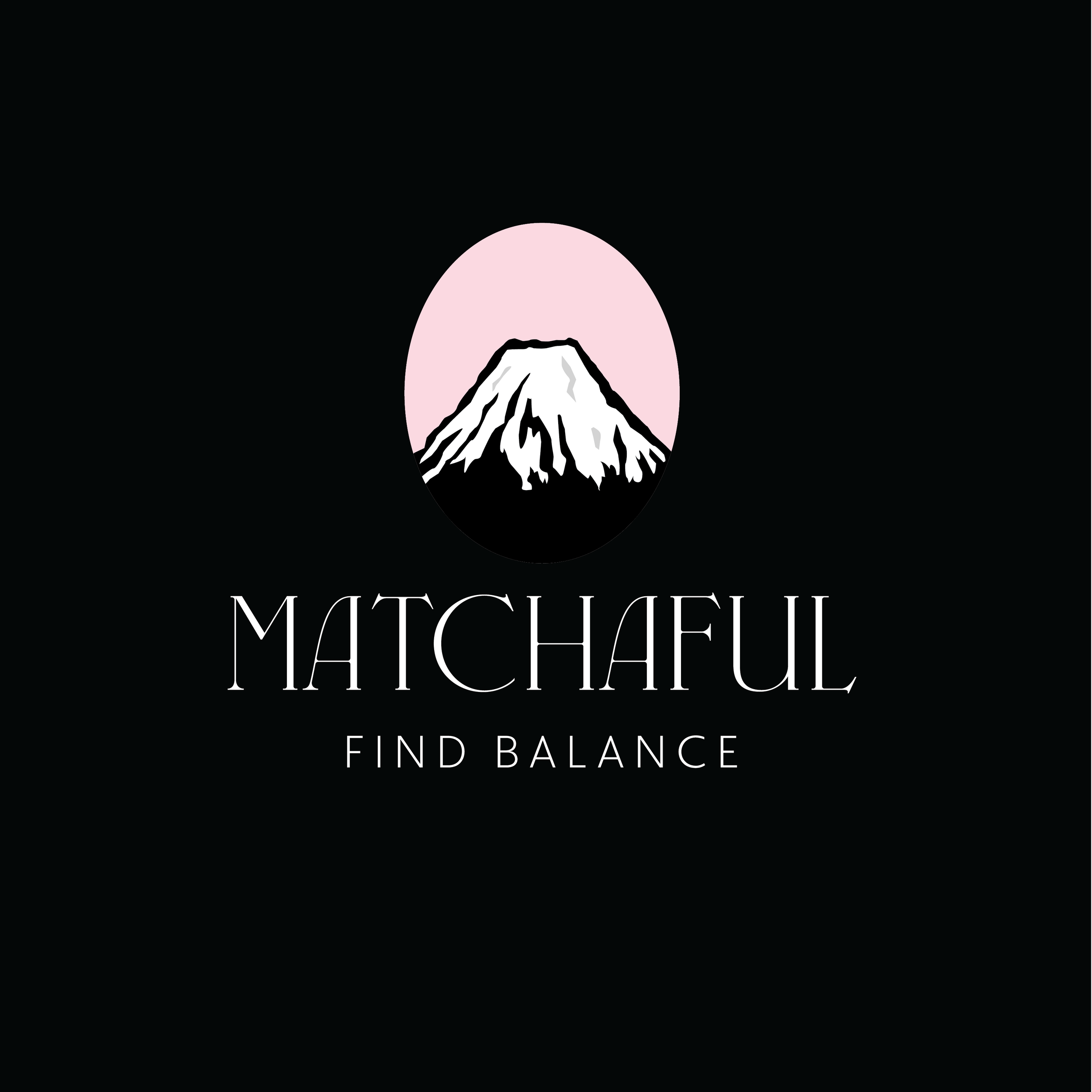
A design challenge was balancing calm, mindful aesthetics with strong shelf impact. Matcha is closely associated with ritual and subtlety, yet the packaging also needed to stand out in busy retail and café environments. This challenge was addressed through intentional contrast, pairing deep matcha greens with soft pinks for visual distinction, giving the logo clear hierarchy, and keeping symbolic elements minimal. Together, these choices allow the brand to feel refined while remaining confident and noticeable at a glance.
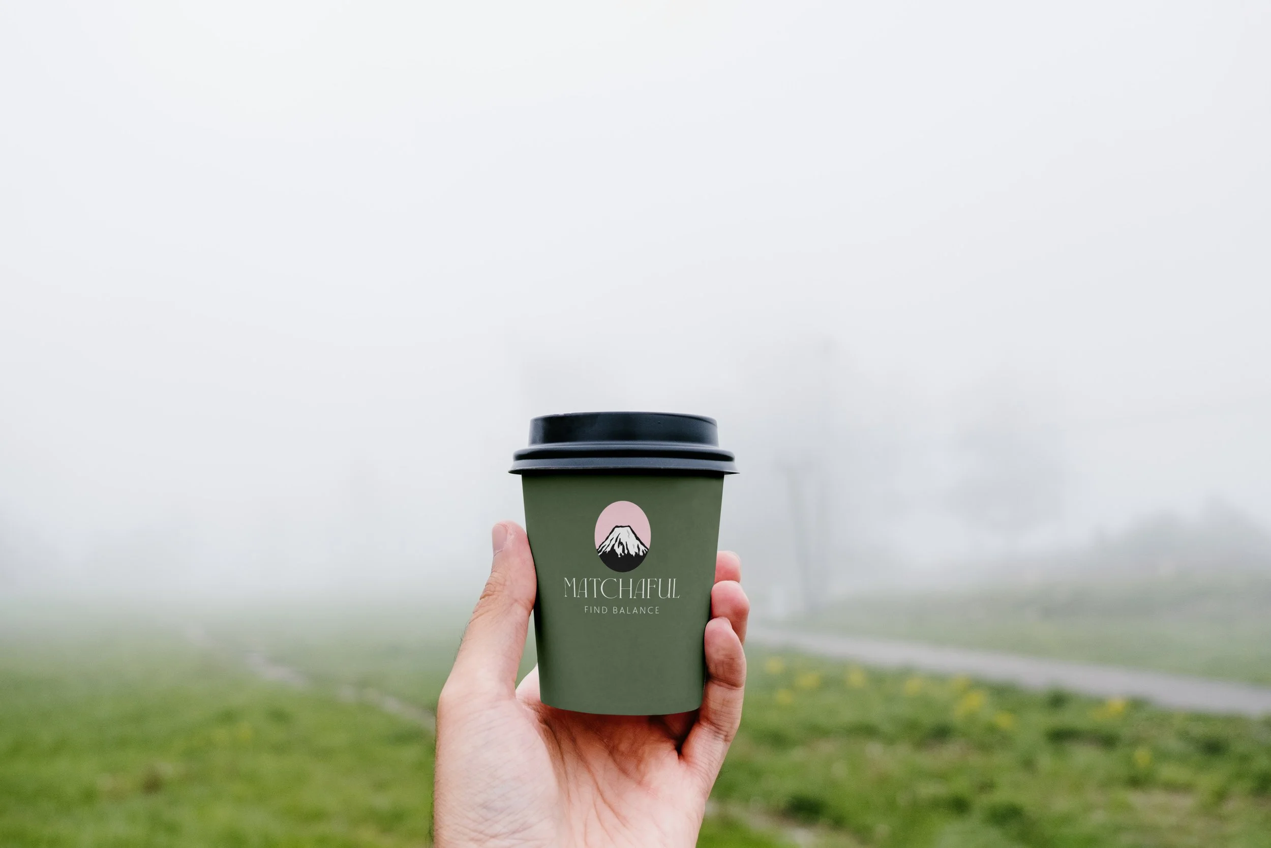
The Matchaful logo is designed to feel elegant and modern, using restraint and simplicity to communicate sophistication. An abstracted Mount Fuji form subtly references the brand’s origin without feeling literal, allowing the mark to remain timeless and refined. Clean lines and balanced proportions give the logo a quiet confidence, while its minimal construction ensures versatility across packaging and digital applications. The result is a mark that feels intentional, elevated, and aligned with the calm, contemporary ritual of matcha.
Brand colors.