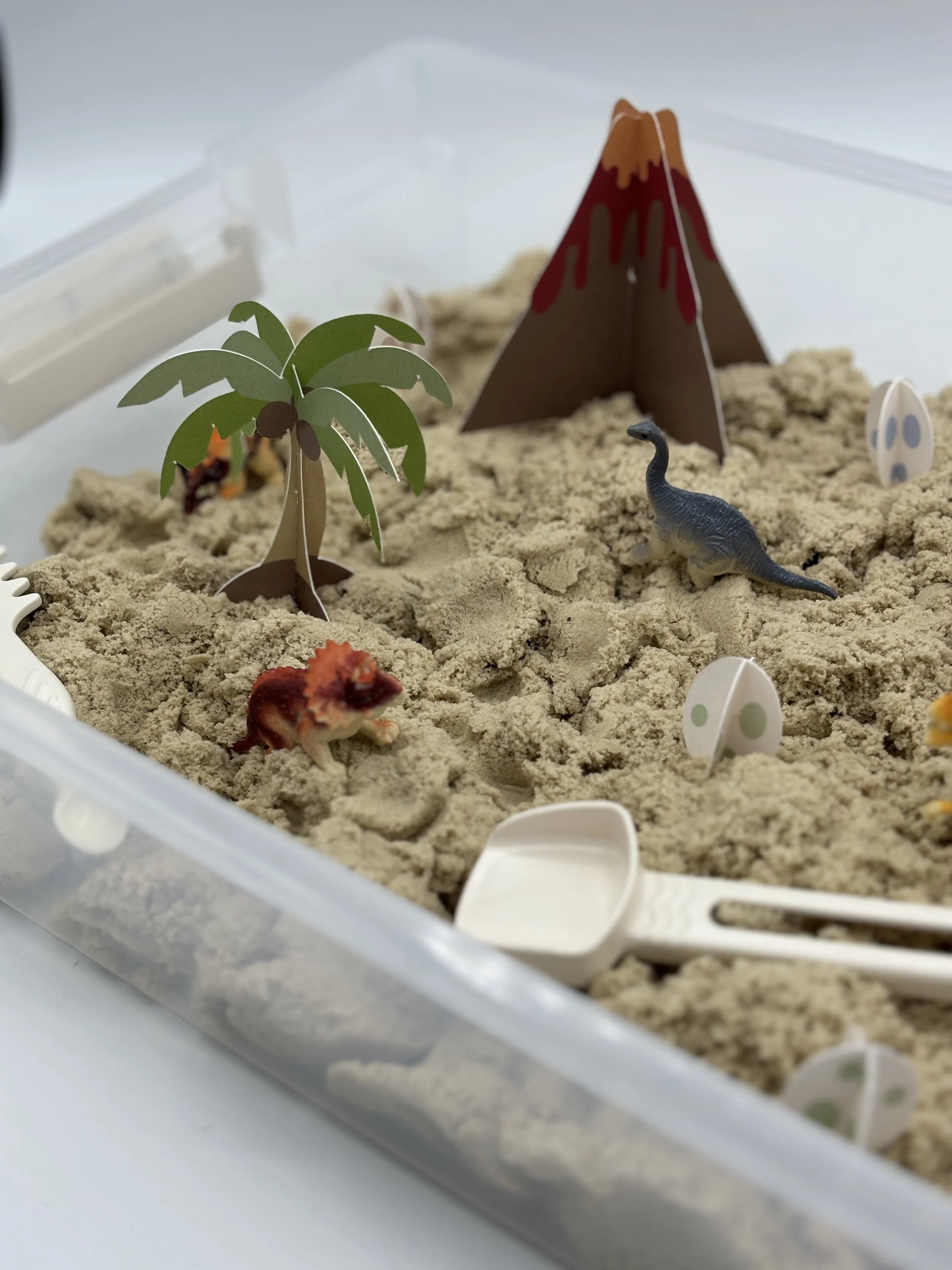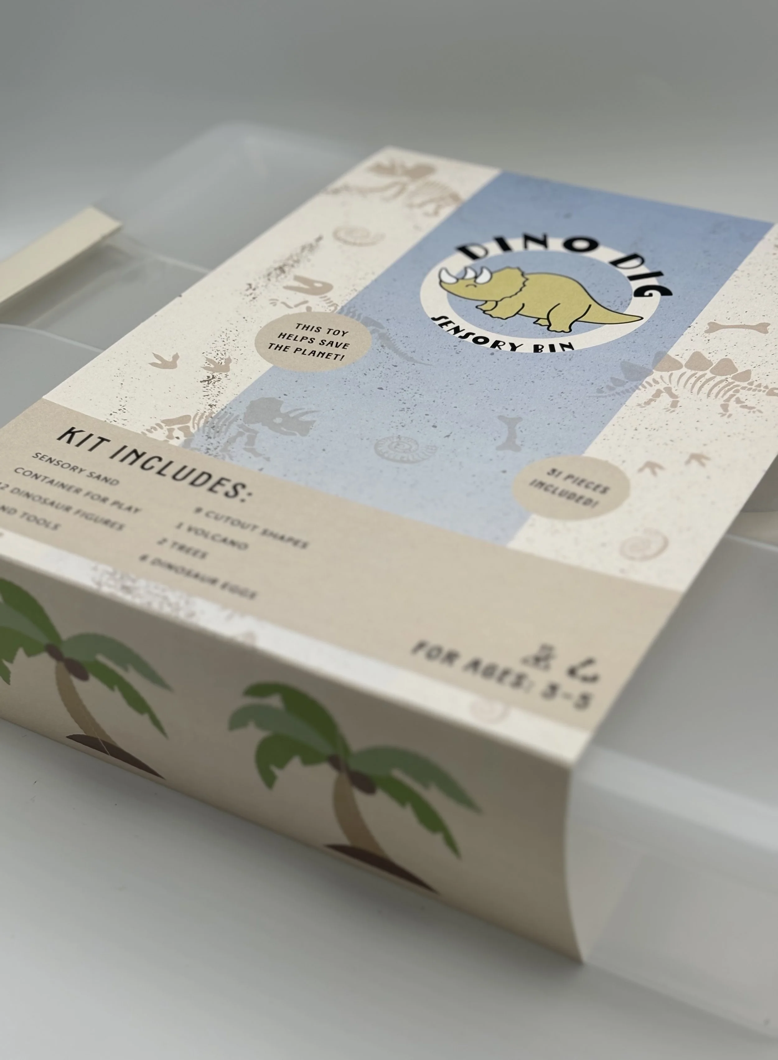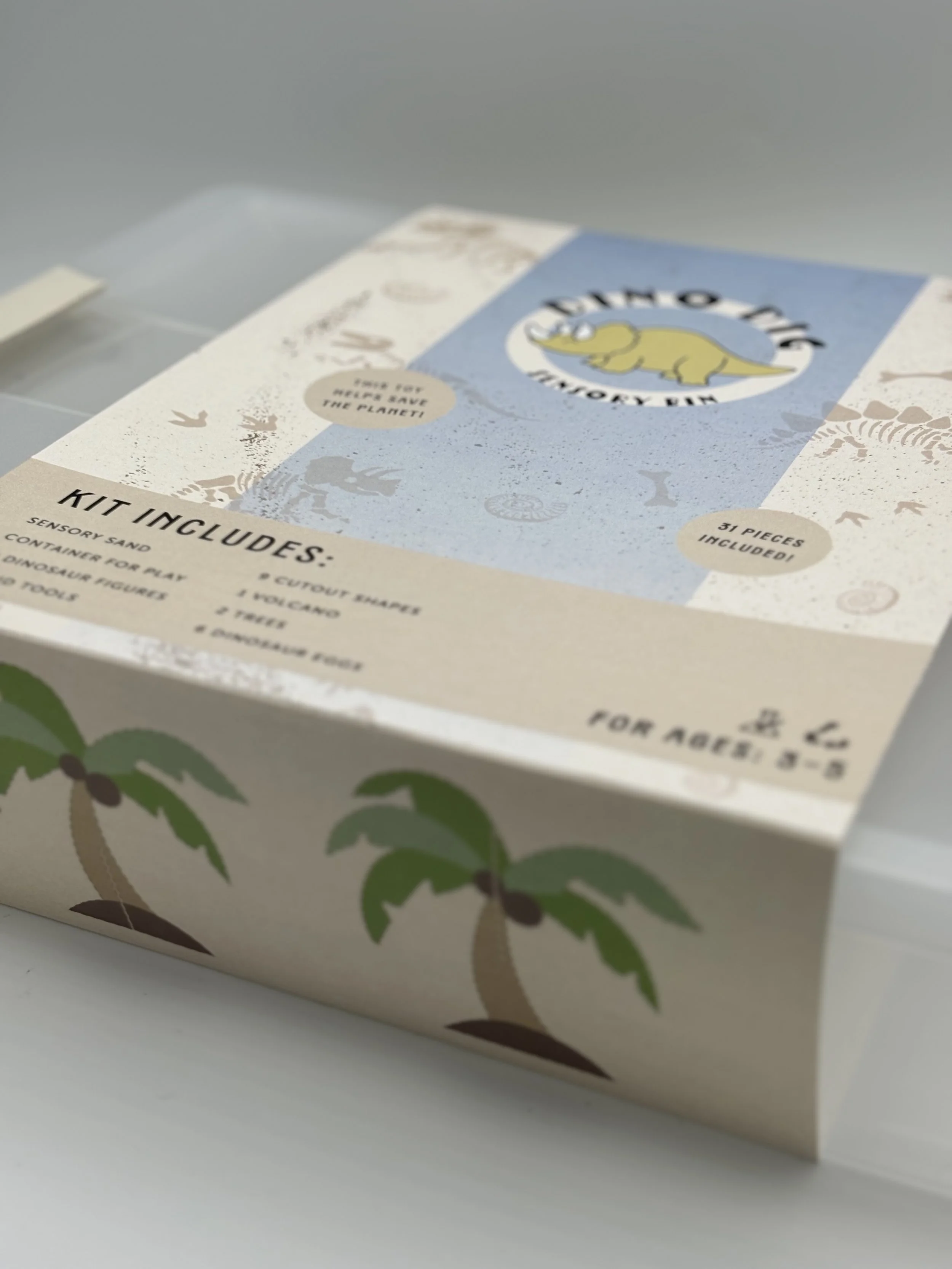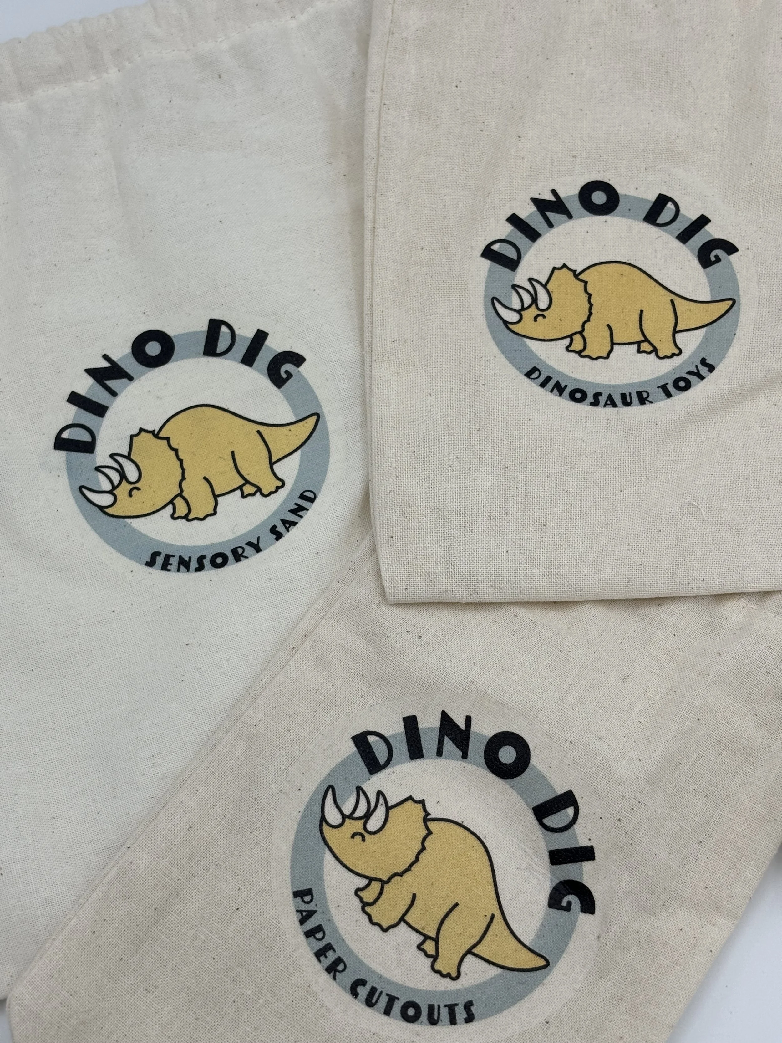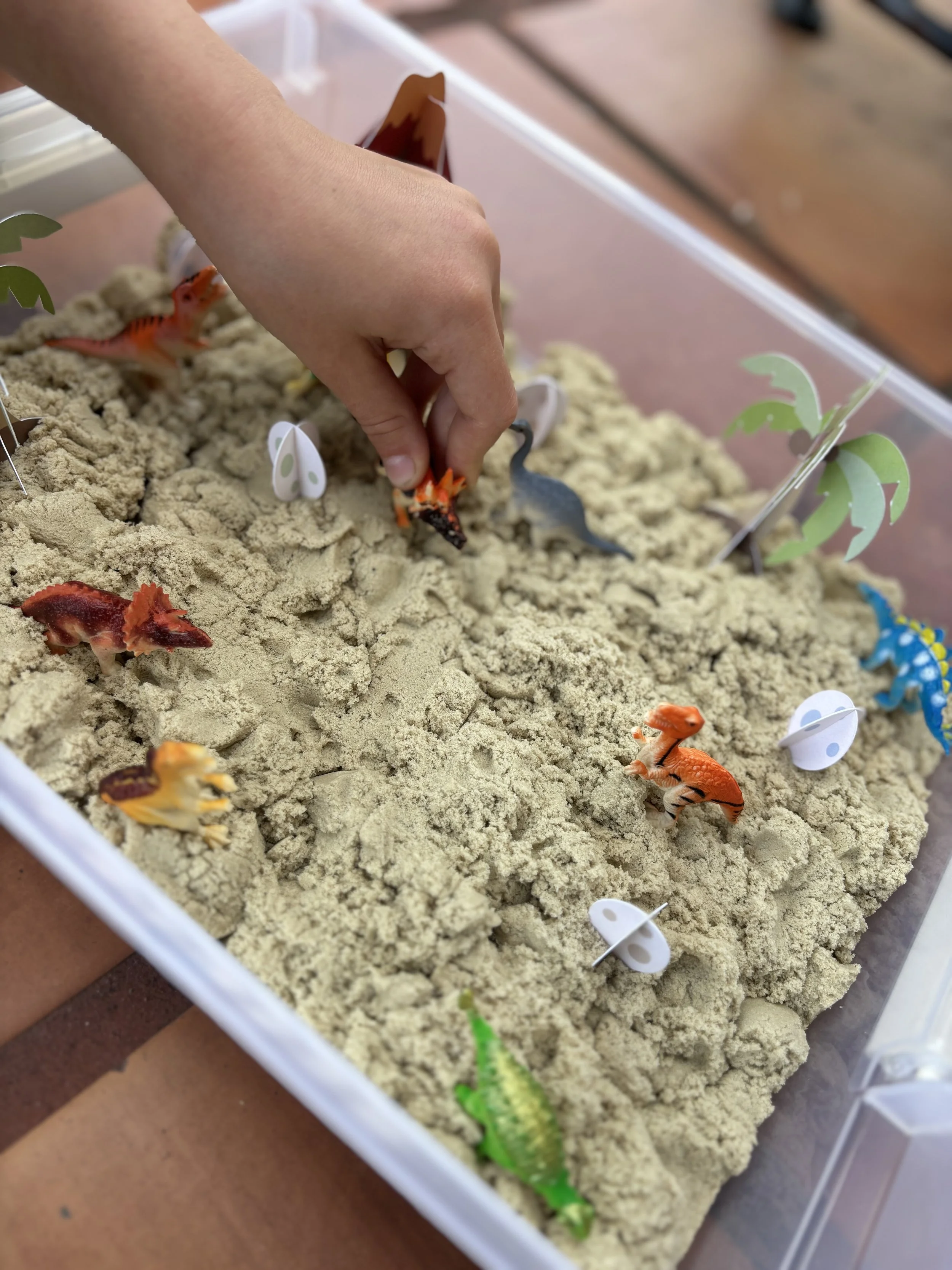
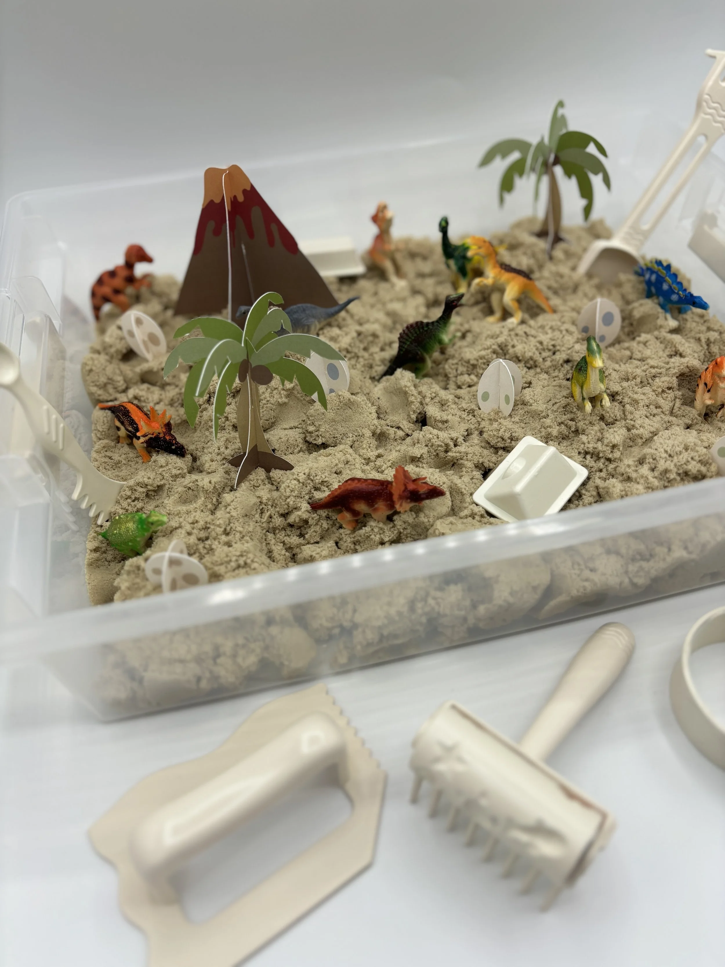
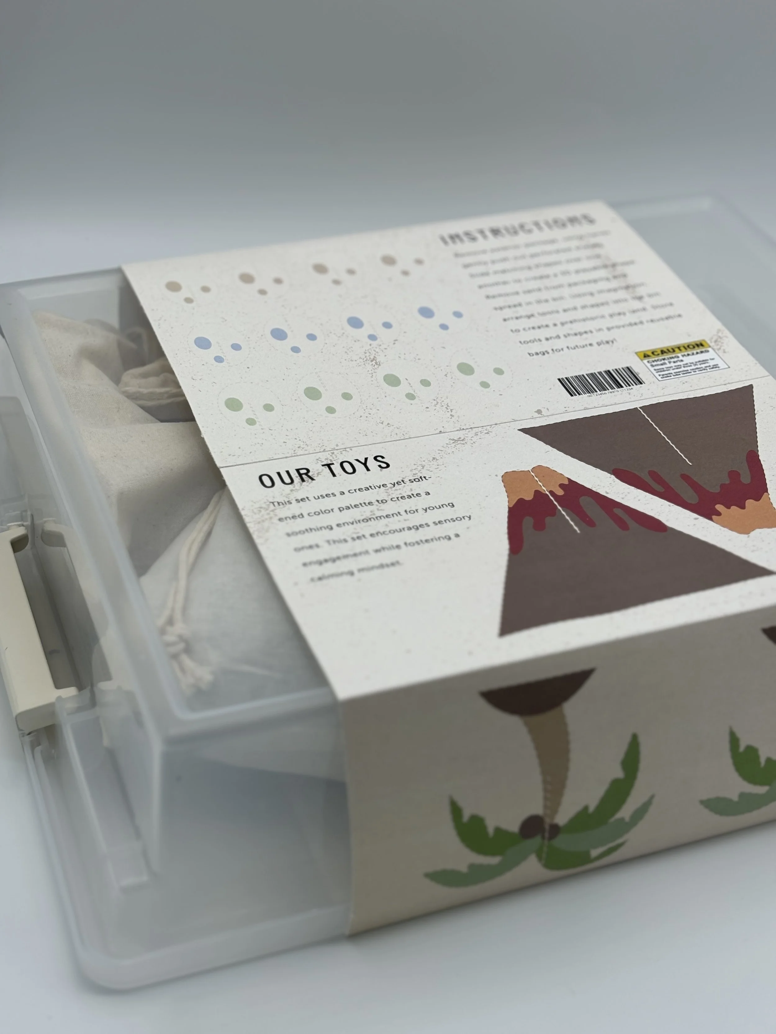
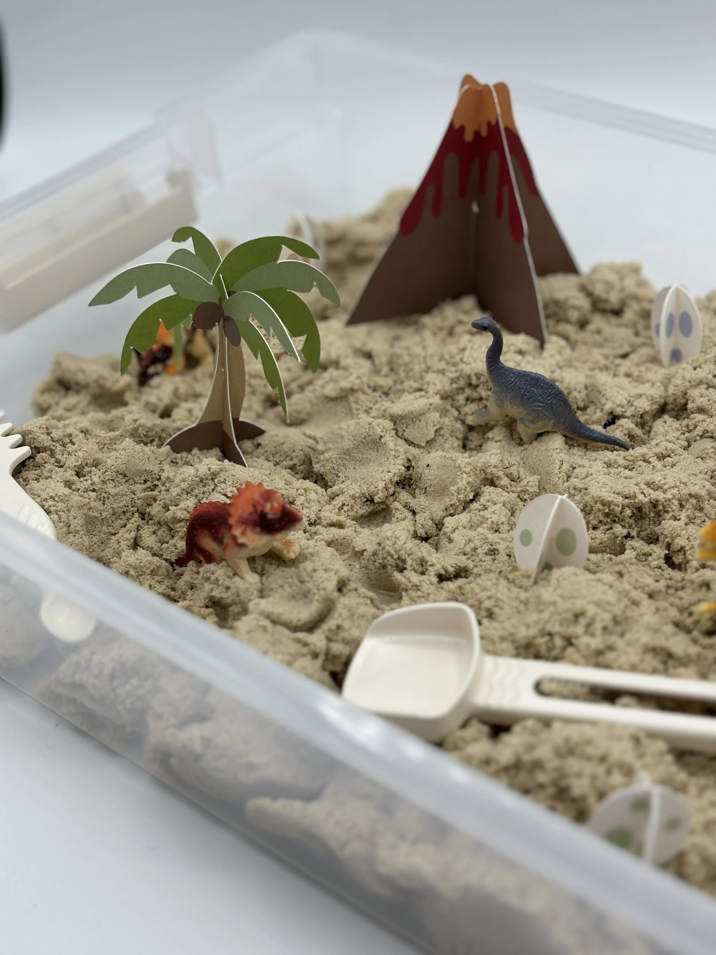
Dino Dig is a sensory bin packaging project designed to make playtime both calming and sustainable. The packaging features a reusable storage container and paper cutouts, allowing the materials to serve a purpose beyond the initial packaging. Instead of being thrown away, the container can be used to store the toy between play sessions, making it a practical part of the experience. A muted color palette complement the calming, sensory-focused concept, creating packaging that feels thoughtful, functional, and made to be kept.
About.
Dielines.

The Challenge.
The challenge was to design packaging for a children’s sensory toy that felt engaging while remaining practical and sustainable. The goal was to create packaging that could be reused beyond its initial purpose, reducing waste without sacrificing functionality. At the same time, the design needed to reflect the calming nature of sensory play through a soft color palette and approachable visual elements.
The packaging was designed to be more than just a box for the toy. By using a reusable container to store the sensory materials and incorporating paper cutouts into the play experience, the packaging continues to serve a purpose even after opening. The muted colors and simple, nature-inspired details help create a calm, inviting look while keeping the design playful.

The Logo.
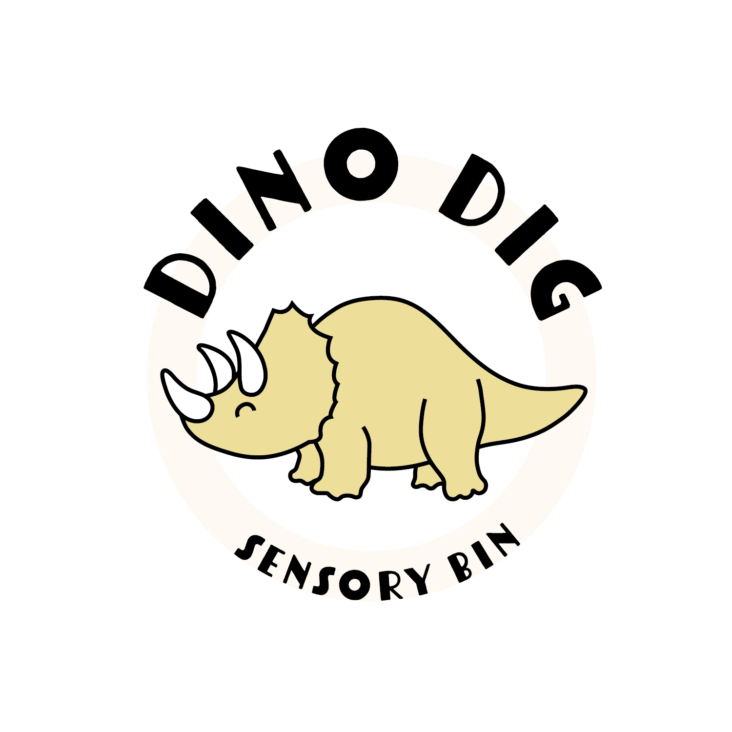
The Dino Dig logo brings a playful, friendly feel to a sensory toy designed for young children. The cute dinosaur illustration gives the brand personality, while the bold, expressive typography makes the logo feel approachable and fun. The muted yellow palette adds warmth without being overwhelming, creating a softer look that reflects the calming, sensory-focused experience of the toy.
Logo Process

Results.