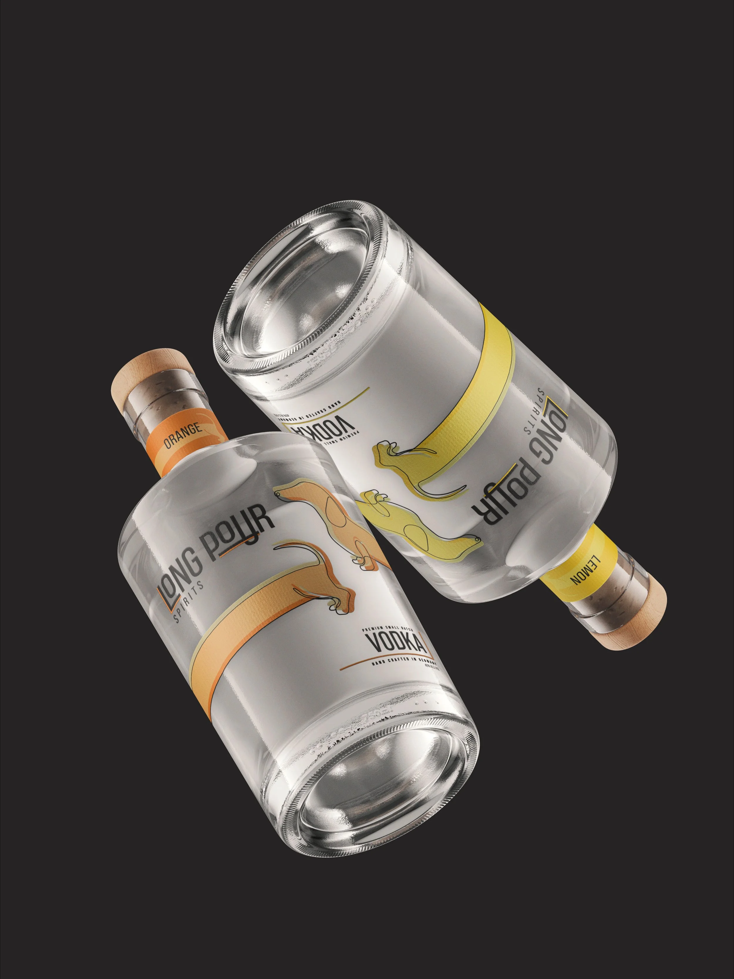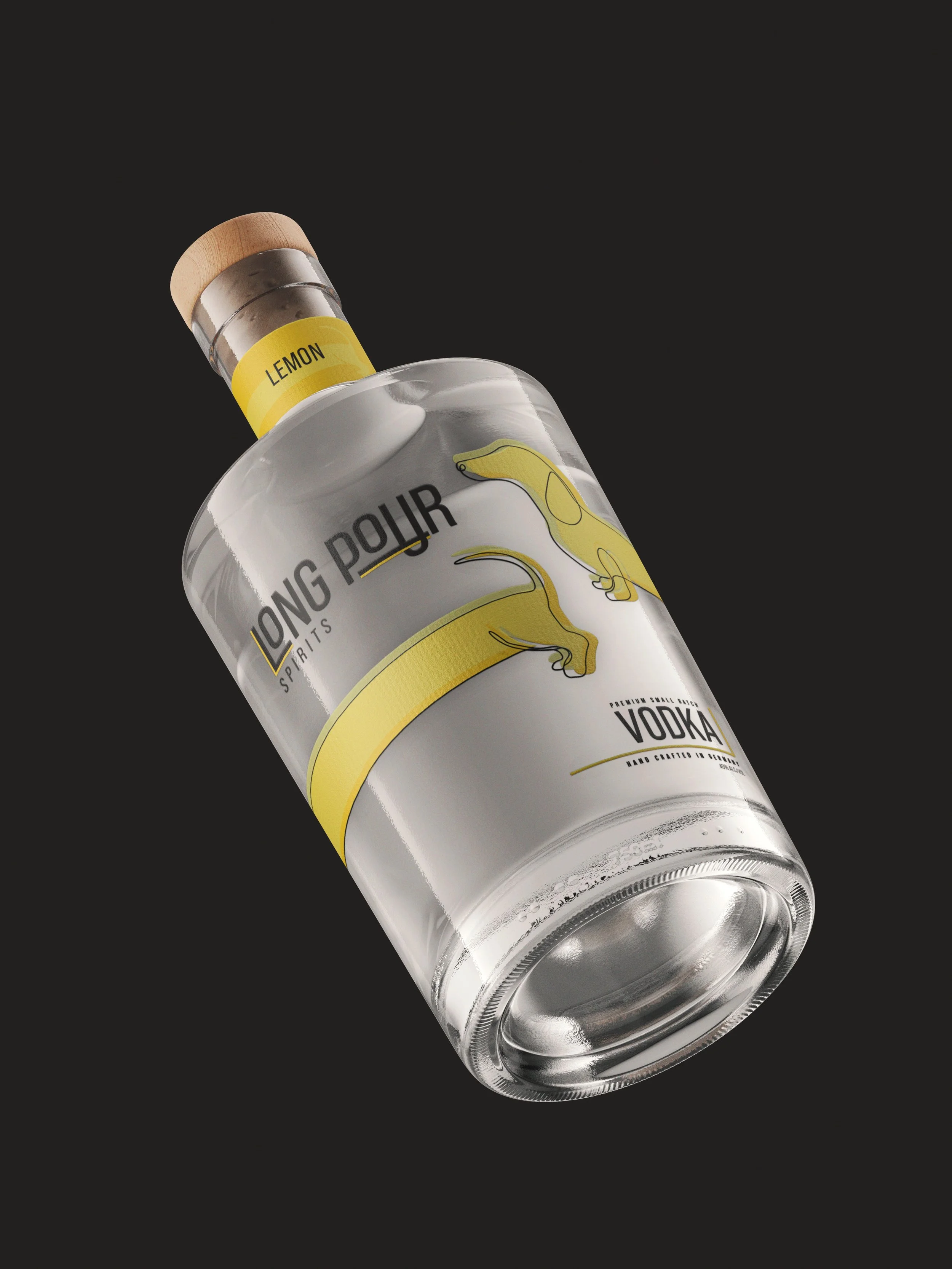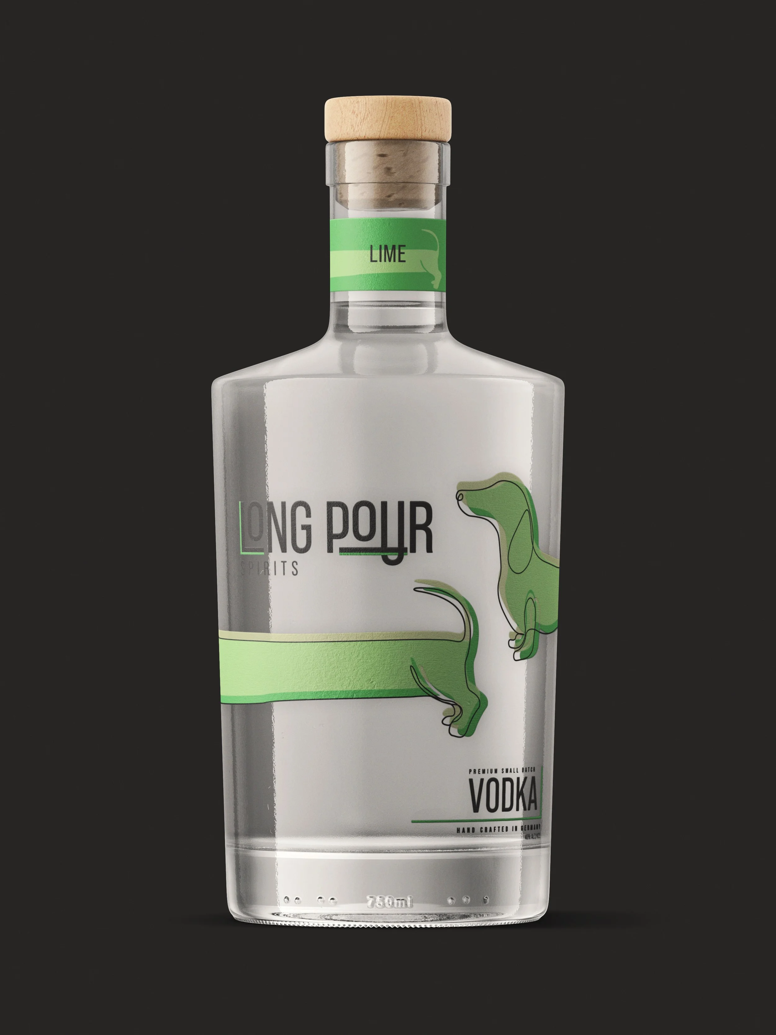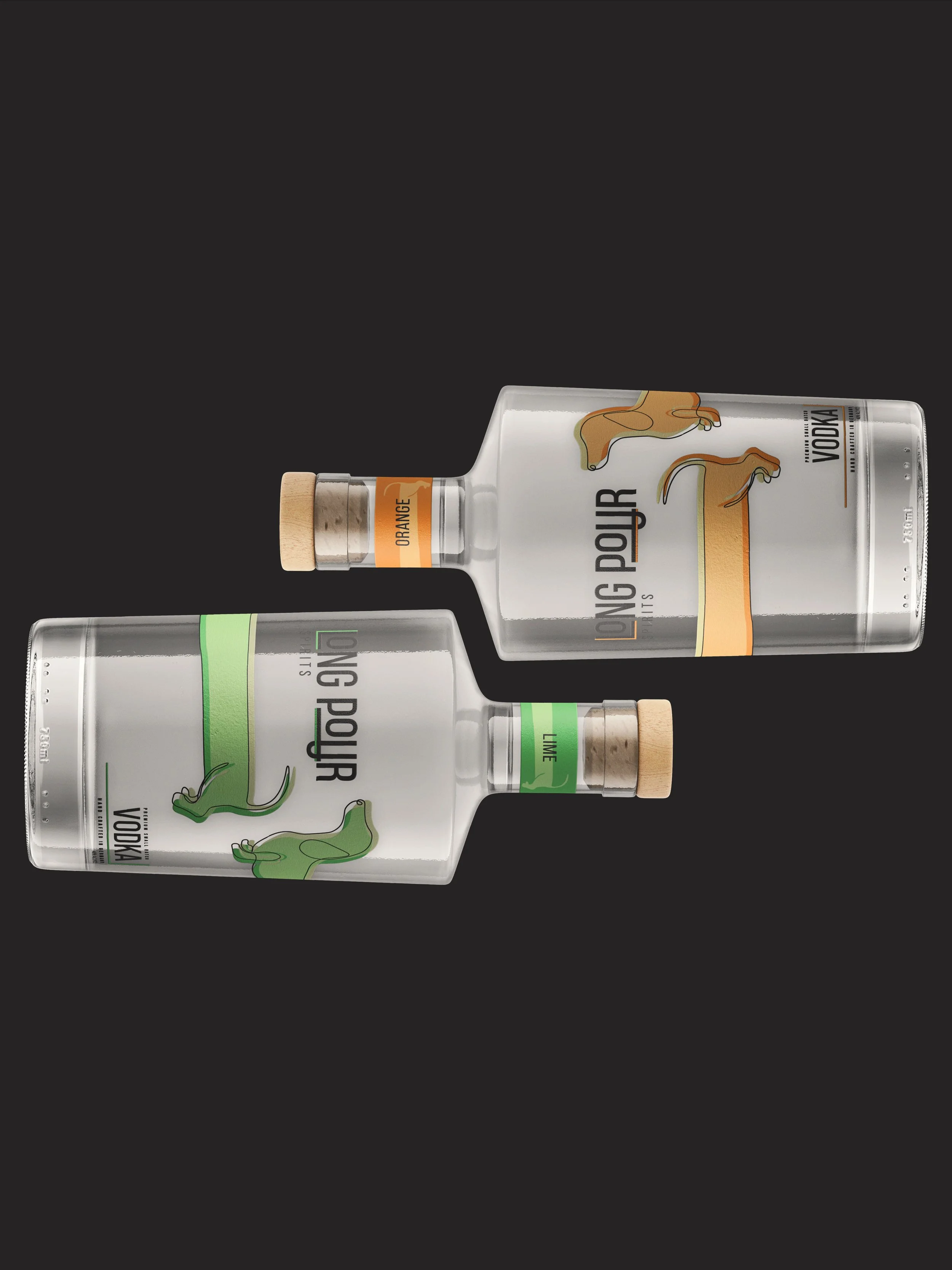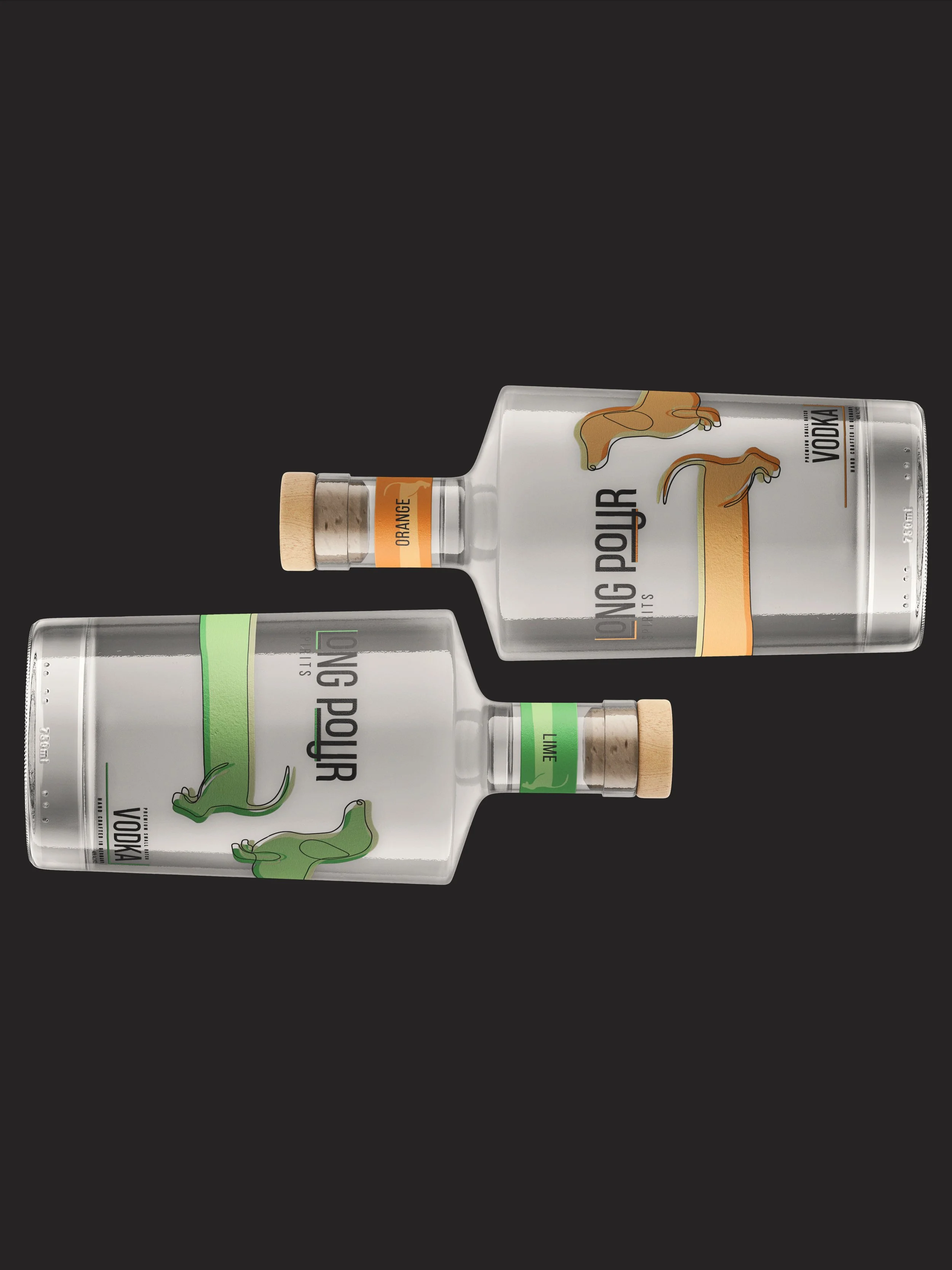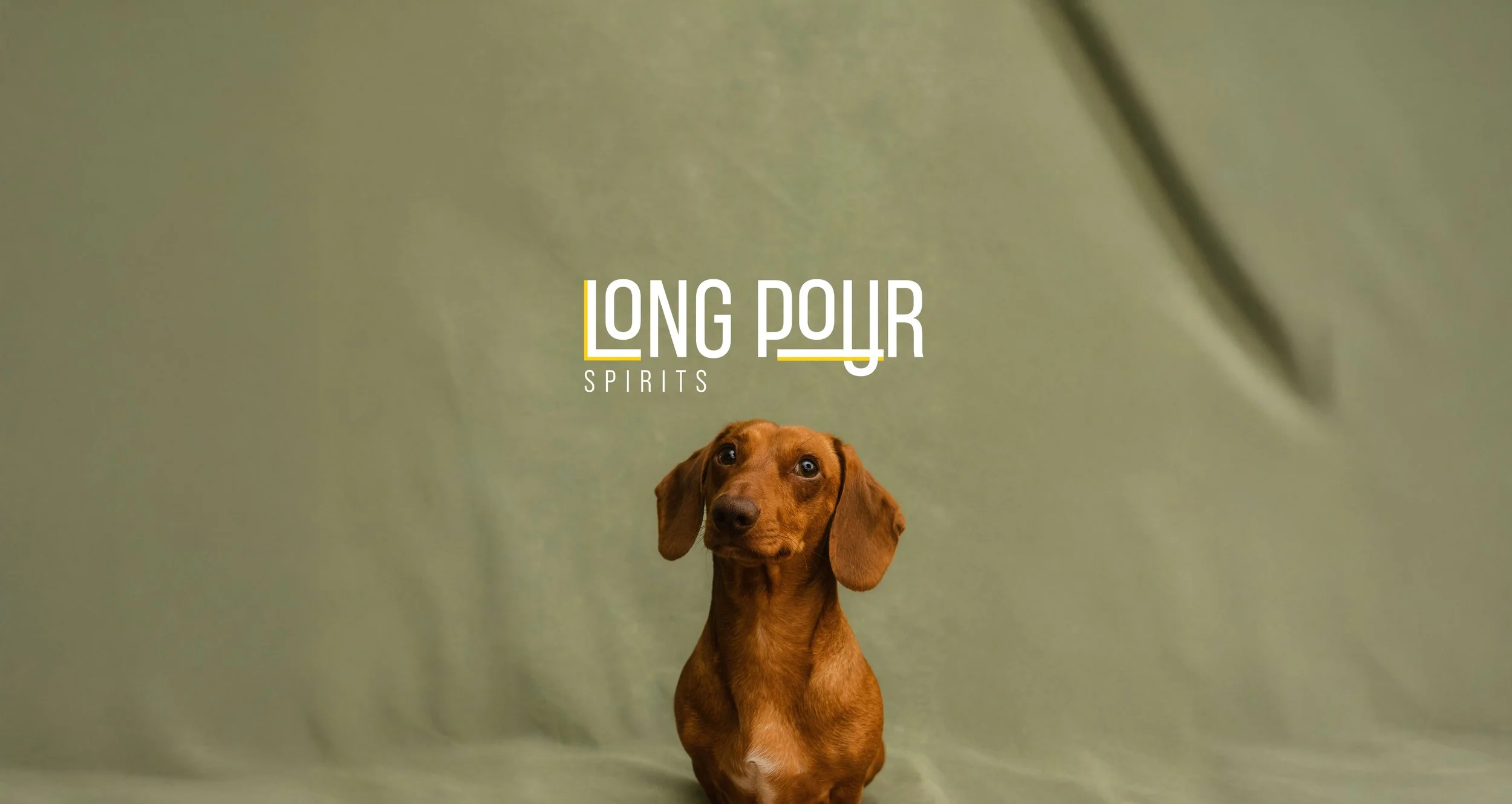
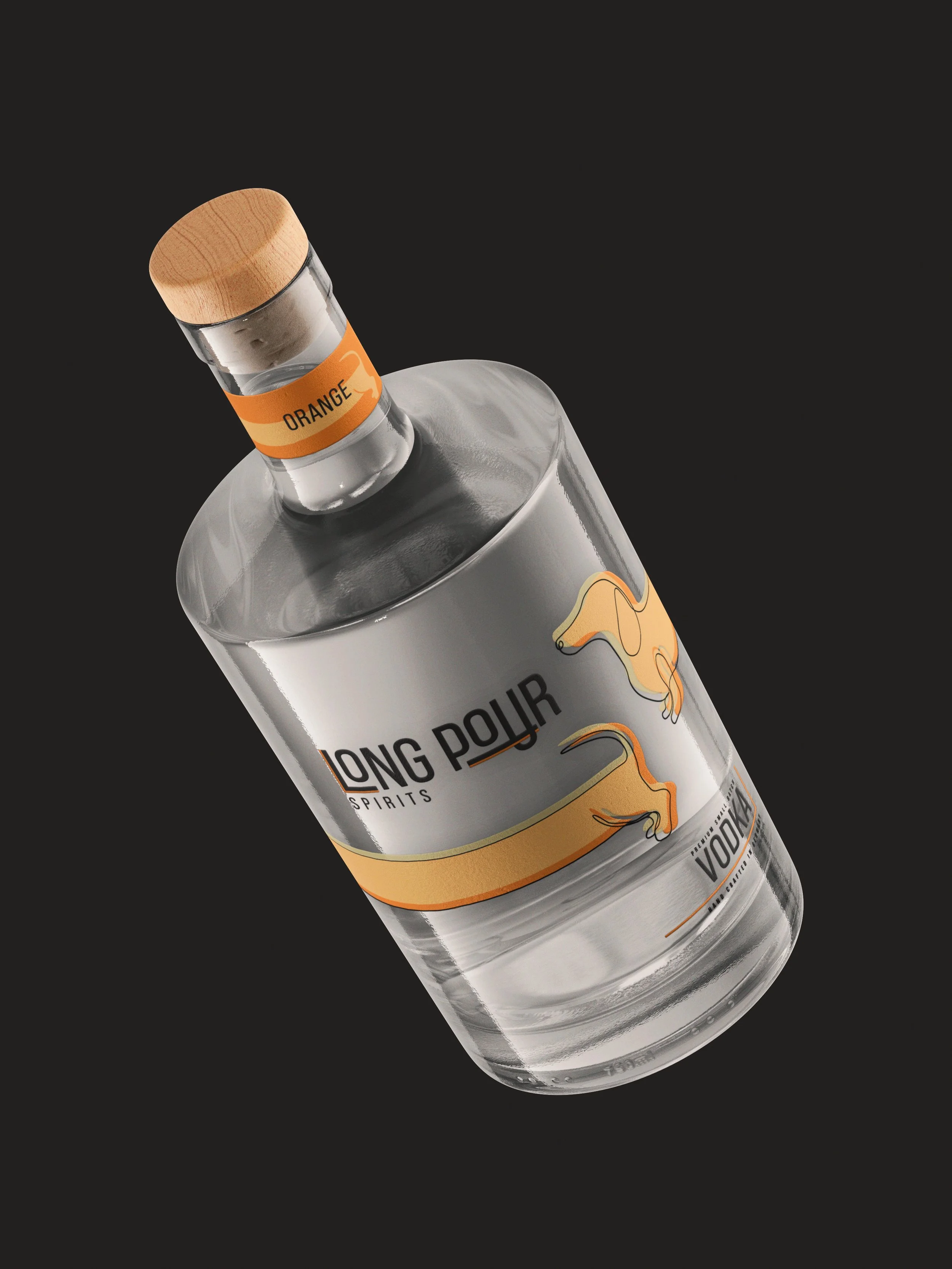
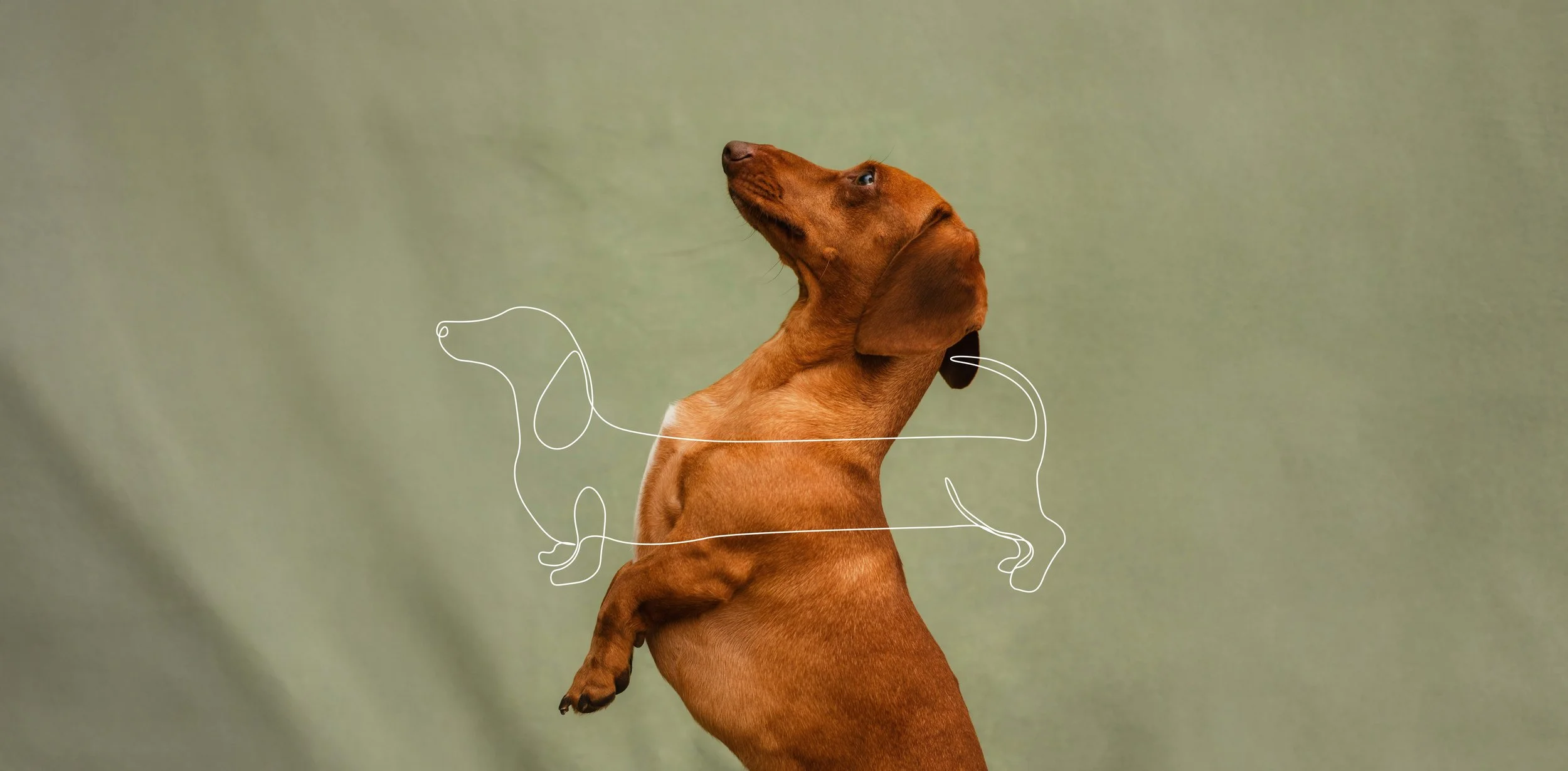
Long Pour began with an exploration of what makes a drink truly memorable. Beyond the smooth finish or crystal-clear bottle, it’s the story behind the pour that lingers. For Long Pour Spirits, that story began with Jefferson, the client’s dachshund, whose long frame and loyal character became the heartbeat of the brand. This brand design is set out to translate that warmth and uniqueness into a vodka brand identity that feels premium, personal, and full of character.
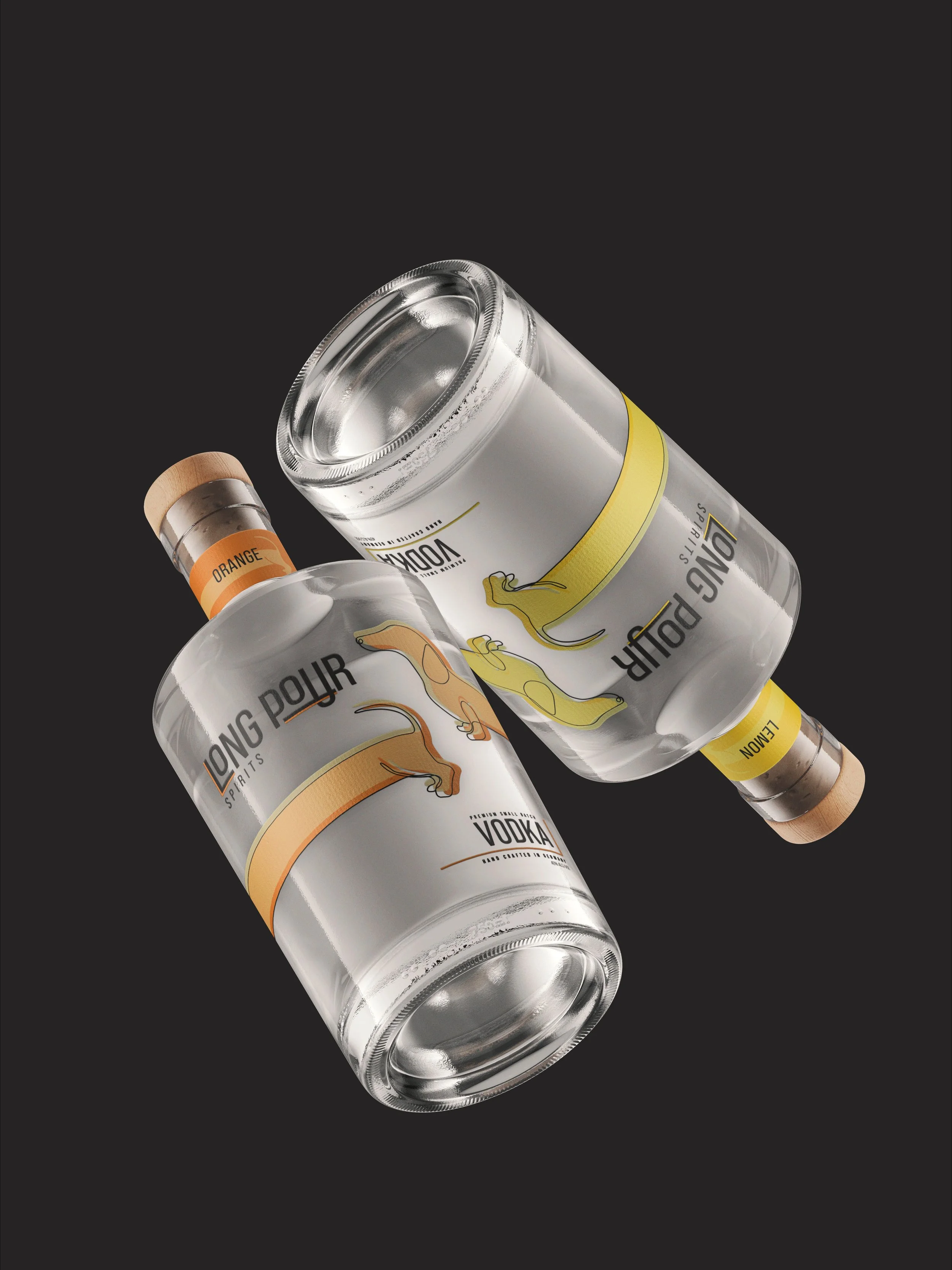
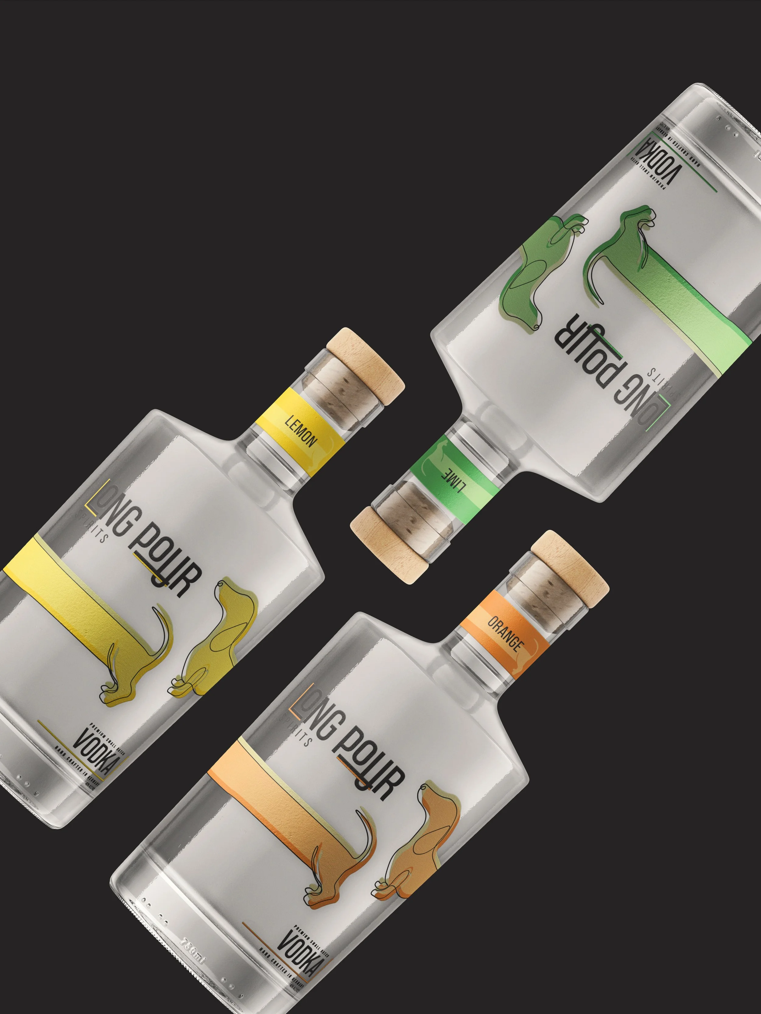
The visual direction draws from citrus-inspired tones, a warm palette of yellow, orange, and green. These colors are used to invoke freshness, vibrancy, and sun-soaked leisure. This color system contrasts with clean typography and minimalist layouts, allowing the playful mascot to remain the hero across packaging.
About.

LOGO PROCESS
THE CHALLENGE.
Brand Colors.
Results.

the logo.
The challenge in this project was to balance playfulness with premium credibility. The illustrated dachshund and bold color accents create a fun, approachable personality, but the challenge lies in ensuring the brand still feels elevated and shelf-worthy in a crowded spirits market. Vodka consumers often associate quality with restraint and refinement, so the design must carefully balance between playful illustration and premium minimalism.
This logo uses typography as visual storytelling to reinforce the brand’s playful concept of a long pour.
The extended line running beneath the wordmark acts as an implied "looong" line, visually stretching the name and emphasizing indulgence. Rather than sitting passively under the type, the line becomes an active design element, suggesting motion and anticipation, like a pour that keeps going just a moment longer.
That sense of movement continues through the line intersecting the "U", which reads as liquid flowing directly through the letterform. This subtle disruption breaks the rigidity of the type and adds a moment of surprise